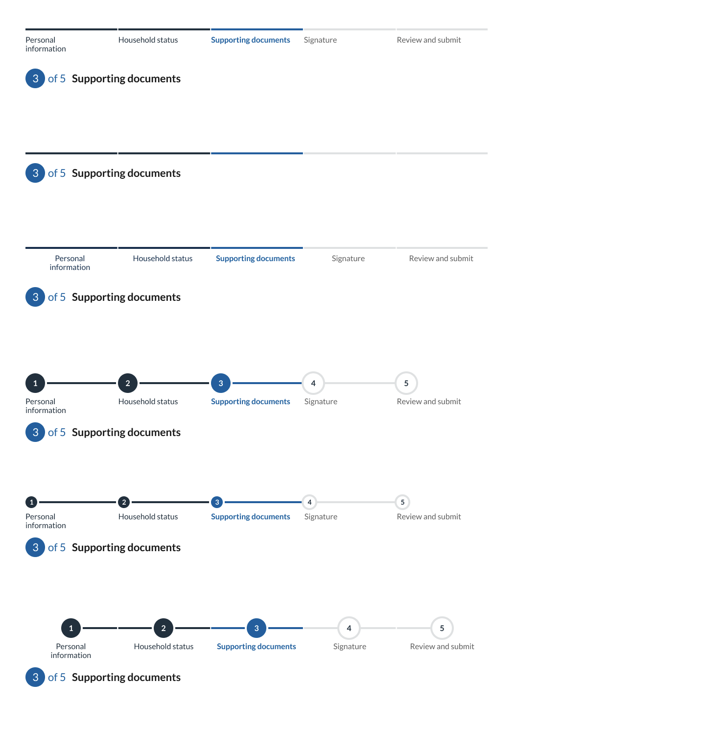
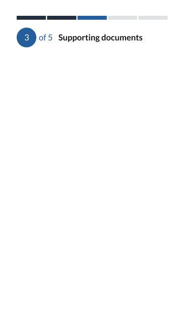
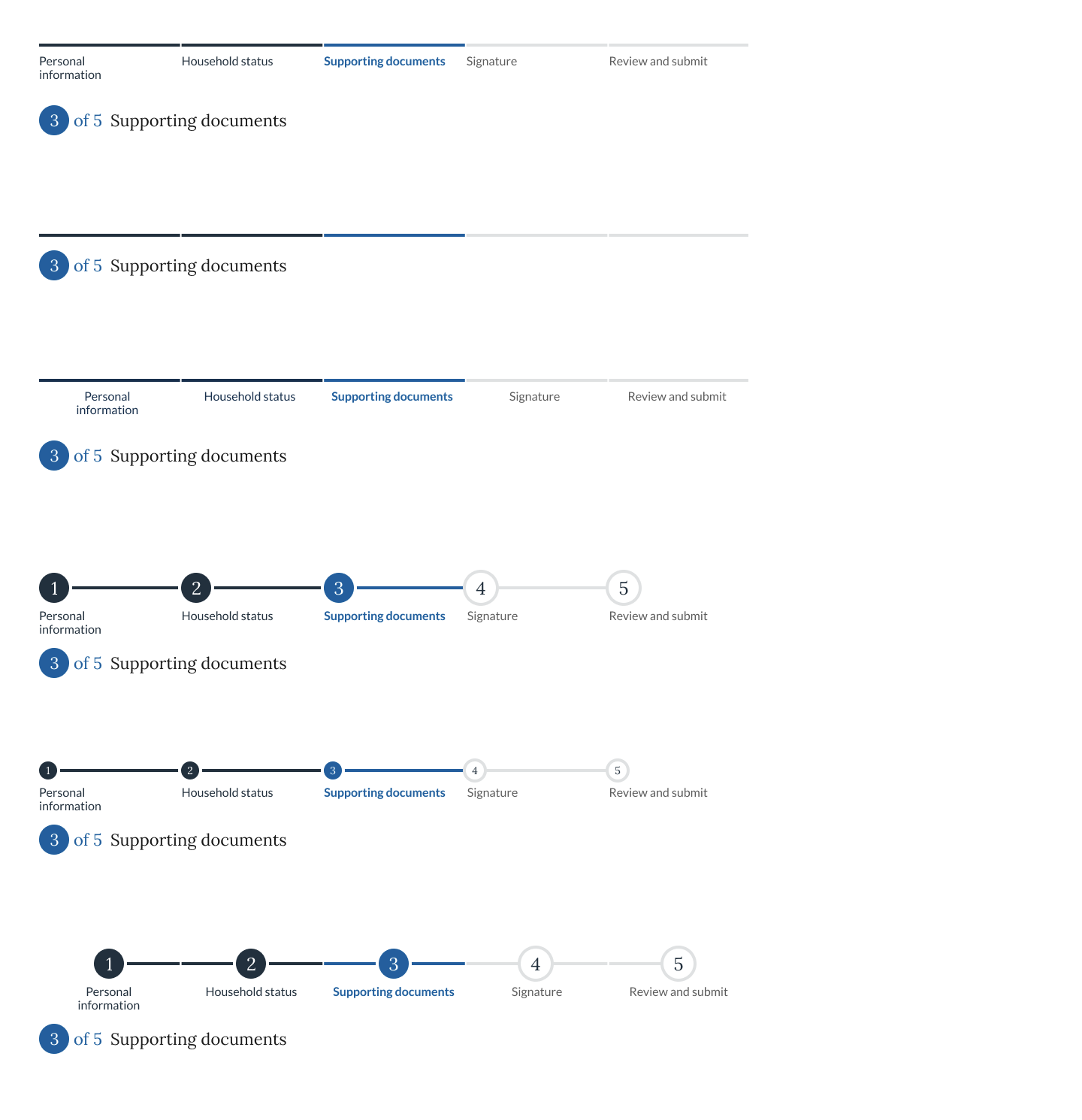
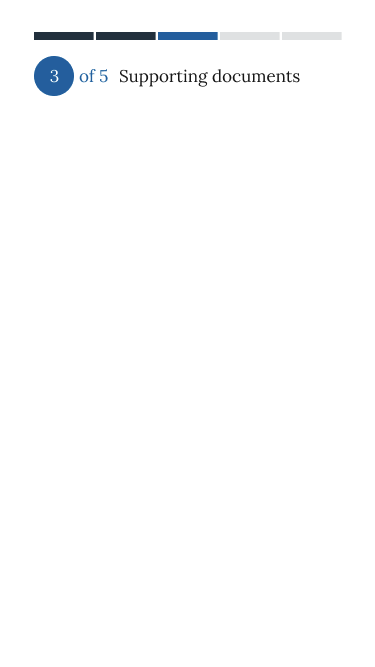
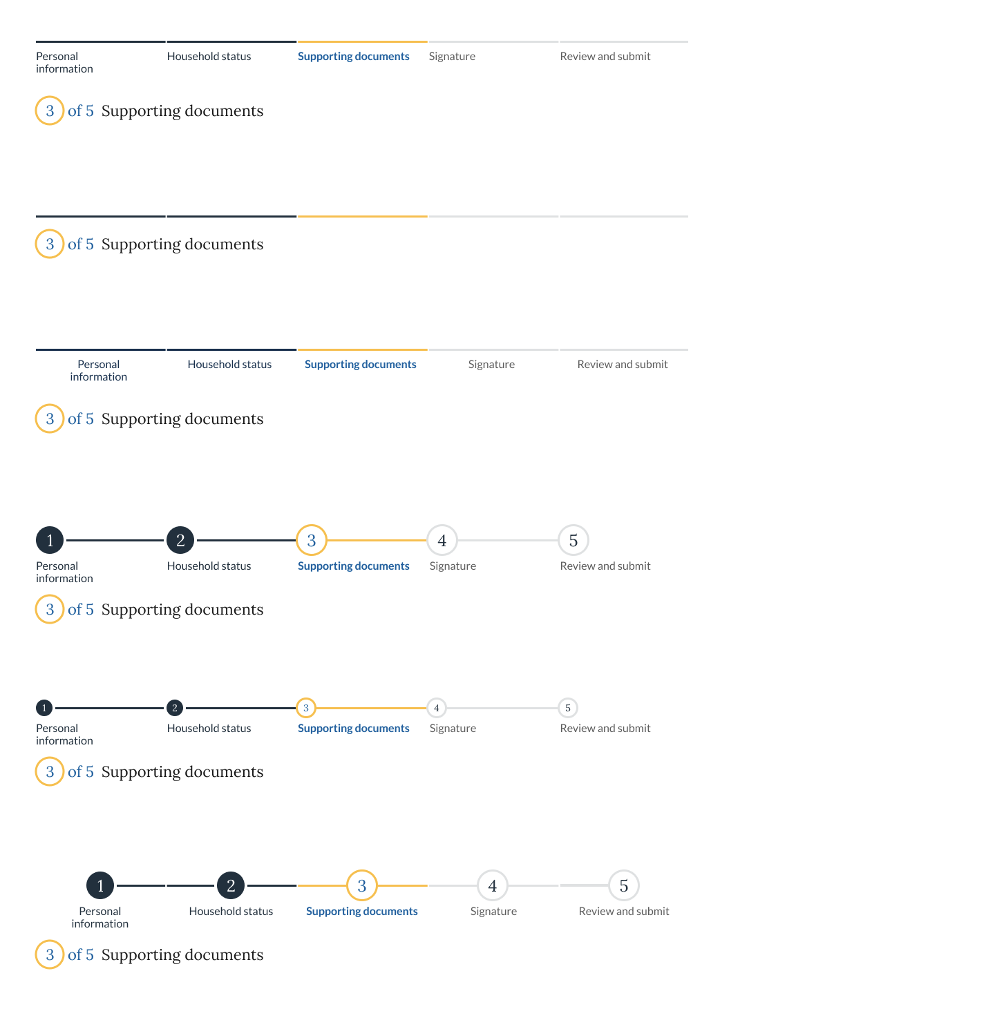
A step indicator updates users on their progress through a multi-step process.
When to use the card component
- Multiple steps and screens. Use the step indicator when the user is working through a form or process that will span several different pages that can be organized into three or more high-level steps or chapters. This helps users understand the progression of long forms and reduces uncertainty as they complete each screen.
- Linear progression. The step indicator is designed to complement standard back/next navigation in a linear sequence, not to be navigation of its own.
When to consider something else
- Long forms with conditional logic. Consider another approach if the number of steps might change due to user input.
- Nonlinear progression. The step indicator isn't appropriate for nonlinear forms or interactions that might be completed in any order.
- Very short forms. Don’t use a step indicator for short forms without chapters or sections. If a form or process has fewer than three sections, don't use a step indicator.
Usability guidance
- Indicate where a user is in the process. Use a color and text treatment for the current step segment that is distinct from both the completed and pending step segments.
- Use short or single-word labels. If labelling the step indicators, stick to very short words.
- Provide navigation separately. Use navigation like a button group to step forward and backward through a form.
Accessibility
- Use semantic heading levels. Use the correct heading level in your implementation.
- Use aria-label="progress". Placing this aria-label on the element with the class usa-step-indicator helps provide important context to screen readers.
- Use visually hidden text on labels. Use visually hidden text make the completion status of each step explicit.
- Indicate the current step When using labeled segments, use aria-current="true" on the list item representing the current step.
- Hide unlabeled segments. There is no content inside the segments when labels aren't used, so it is safe to add aria-hidden="true" to the element with the class name usa-step-indicator__segments.
Implementation
| Field |
Value |
Name |
| Step: Status |
|
|
| Step: Label |
|
|
| Variants |
Values |
Name |
| Labels |
show or hide |
|
| Counters |
show (default) or hide (default) |
|
| Counters size |
default (default) or small |
|
| Alignment |
default (default) or center |
|
Related USWDS Components
Theme
| Element |
Effects |
Global/Component |
| $theme-step-indicator-background-color |
Background color |
Component |
| $theme-step-indicator-counter-gap |
Counter |
Component |
| $theme-step-indicator-counter-border-width |
Counter |
Component |
| $theme-step-indicator-font-family |
Counter and Label |
Component |
| $theme-step-indicator-heading-font-family |
Headings |
Component |
| $theme-step-indicator-heading-color |
Headings |
Component |
| $theme-step-indicator-heading-font-size |
Headings |
Component |
| $theme-step-indicator-heading-font-size-small |
Headings |
Component |
| $theme-step-indicator-label-font-size |
Step Item |
Component |
| $theme-step-indicator-min-width |
Layout |
Component |
| $theme-step-indicator-segment-color-pending |
Segment |
Component |
| $theme-step-indicator-segment-color-complete |
Segment |
Component |
| $theme-step-indicator-segment-color-current |
Segment |
Component |
| $theme-step-indicator-segment-gap |
Segment |
Component |
| $theme-step-indicator-segment-heigh |
Segment |
Component |
| $theme-step-indicator-text-pending-color |
Step Item |
Component |
Questions:
Figma:
https://www.figma.com/file/UW0WNmfKZOmAOE5zsSYEx5/JCC-Base?node-id=267%3A1096
https://www.figma.com/file/UW0WNmfKZOmAOE5zsSYEx5/JCC-Base?node-id=267%3A1210
https://www.figma.com/file/UW0WNmfKZOmAOE5zsSYEx5/JCC-Base?node-id=270%3A1381
https://www.figma.com/file/UW0WNmfKZOmAOE5zsSYEx5/JCC-Base?node-id=270%3A1495
https://www.figma.com/file/UW0WNmfKZOmAOE5zsSYEx5/JCC-Base?node-id=272%3A1045
A step indicator updates users on their progress through a multi-step process.
When to use the card component
When to consider something else
Usability guidance
Accessibility
Implementation
Related USWDS Components
Theme
Questions:
Figma:
https://www.figma.com/file/UW0WNmfKZOmAOE5zsSYEx5/JCC-Base?node-id=267%3A1096
https://www.figma.com/file/UW0WNmfKZOmAOE5zsSYEx5/JCC-Base?node-id=267%3A1210
https://www.figma.com/file/UW0WNmfKZOmAOE5zsSYEx5/JCC-Base?node-id=270%3A1381
https://www.figma.com/file/UW0WNmfKZOmAOE5zsSYEx5/JCC-Base?node-id=270%3A1495
https://www.figma.com/file/UW0WNmfKZOmAOE5zsSYEx5/JCC-Base?node-id=272%3A1045