So the goal here is to have the course section maintain a 2 row 3 column grid regardless of screen size until the mobile query kicks in.
Right now wrapping changes to the resolution of the screen. Animated Gif illustrating this below.
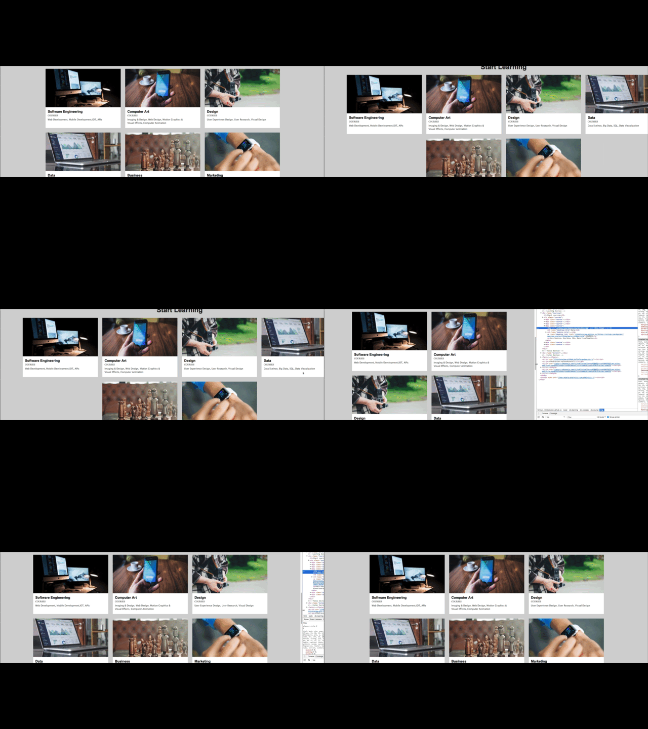
This is happening because your container doesn't have a width set to it. In this case, if you set each container to width: 30%, the container will maintain the same percentage in relation to the viewport size. Since this is 30 percent, it always is 3 columns wide at 90 percent of the total width.
You will have to make other adjustments to your styling so the container looks the same consistency without distortion after this style change.
So the goal here is to have the course section maintain a 2 row 3 column grid regardless of screen size until the mobile query kicks in.
Right now wrapping changes to the resolution of the screen. Animated Gif illustrating this below.
This is happening because your container doesn't have a width set to it. In this case, if you set each container to width: 30%, the container will maintain the same percentage in relation to the viewport size. Since this is 30 percent, it always is 3 columns wide at 90 percent of the total width.
You will have to make other adjustments to your styling so the container looks the same consistency without distortion after this style change.