| title | description |
|---|---|
How to Create Flutter Accordion Widget Design with Example Code |
GF Flutter Accordion expands or collapses the view of its children when it is tapped. GFAccordion is used to collapse and expand the content to view the messages. |
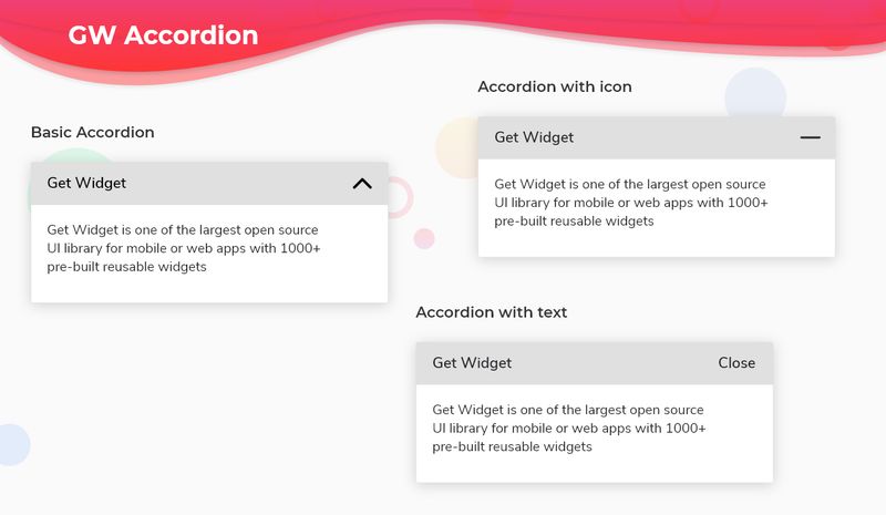
Flutter Accordion is an expansion tile wherein the content or the body of the title will be hidden or collapsed and it will be expanded only when clicking the title of the expansion tile. The content can be of any widget and can have any number of lines. The dropdown arrow shows whether the tile is expanded or collapsed according to the need.
GFAccordion is a Flutter Accordion that is an expansion tile wherein the content or the body of the title will be hidden or collapsed and it will be expanded only when clicking the title of the expansion tile. The content can be of any widget and can have any number of lines. The dropdown arrow shows whether the tile is expanded or collapsed according to the need.
GFAccordion has a simple title and its content as arguments and it can also be customized. Now let us take a look at a simple code of GFAccordion
 import 'package:getwidget/getwidget.dart';

GFAccordion(
    title: 'GF Accordion',
    content: 'GetFlutter is an open source library that comes with pre-build 1000+ UI components.'
)
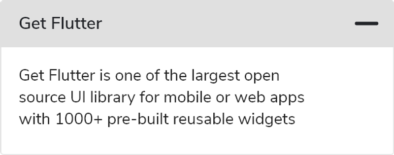
Icons are mostly used in GFAccordion to show whether the content is expanded or collapsed. The most commonly used icons are the up and down arrow icons. But we can use different icons to represent the hide and show event by using collapsedIcon and expandedIcon. The below code shows the usage:
Icons are mostly used in Accordion to show whether the content is expanded or collapsed. The most commonly used icons are the up and down arrow icons. But we can use different icons to represent the hide and show event by using collapsedIcon and expandedIcon. The below code shows the usage:
import 'package:getwidget/getwidget.dart';

GFAccordion(
    title: 'GF Accordion',
    content: 'GetFlutter is an open source library that comes with pre-build 1000+ UI components.',
    collapsedIcon: Icon(Icons.add),
    expandedIcon: Icon(Icons.minimize)
),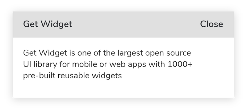
The icons represent whether the Accordion is collapsed or expanded. We can customize the icons by using a Text widget instead of icons. The text can be usually open or close, hide or show. In the below example code we have hide and show text in place of up and down arrows.
The trailing part or the right part of the Accordion takes any widget like text, icon, etc. The below code shows the accordion with the text.
import 'package:getwidget/getwidget.dart';

 GFAccordion(
     title: 'GF Accordion',
     content: 'GetFlutter is an open source library that comes with pre-build 1000+ UI components.',
     collapsedIcon: Text('Show'),
     expandedIcon: Text('Hide')
),A simple GFAccordion can be customized according to the need and hence there are other custom properties that are listed below:
| Name | Description |
|---|---|
| showAccordion | controls if the accordion should be collapsed or not making it possible to be controlled from outside |
| titleChild | child of type [Widget]is an alternative to the title key. the title will get priority over titleChild |
| content | content of type[String] which shows the messages after the [GFAccordion] is expanded |
| contentChild | contentChild of type [Widget]is an alternative to the content key. content will get priority over the contentChild |
| collapsedTitleBackgroundColor | type of [Color] or [GFColors] which is used to change the background color of the [GFAccordion] title when it is collapsed |
| expandedTitleBackgroundColor | type of [Color] or [GFColors] which is used to change the background color of the [GFAccordion] title when it is expanded |
| collapsedIcon | collapsedIcon of type [Widget] which is used to show when the [GFAccordion] is collapsed |
| expandedIcon | expandedIcon of type[Widget] which is used when the [GFAccordion] is expanded |
| title | text of type [String] is alternative to the child. text will get priority over titleChild |
| textStyle | textStyle of type [textStyle] will be applicable to text only and not for the child |
| titlePadding | titlePadding of type [EdgeInsets] which is used to set the padding of the [GFAccordion] title |
| contentPadding | descriptionPadding of type [EdgeInsets] which is used to set the padding of the [GFAccordion] description |
| contentBackgroundColor | type of [Color] or [GFColors] which is used to change the background color of the [GFAccordion] description |
| margin | margin of type [EdgeInsets] which is used to set the margin of the [GFAccordion] |
| titleBorder | titleBorderColor of type [Color] or [GFColors] which is used to change the border color of the title |
| contentBorder | contentBorderColor of type [Color] or [GFColors] which is used to change the border color of the content |
| titleBorderRadius | titleBorderRadius of type [Radius] which is used to change the border radius of title |
| contentBorderRadius | contentBorderRadius of type [Radius] which is used to change the border radius of content |
| onToggleCollapsed | function called when the content body collapsed |