A React component for swipeable views.
| Package | Version |
|---|---|
| @mohalla-tech/react-swipeable-wrapper |  |
npm install --save @mohalla-tech/react-swipeable-wrapper
or
yarn add @mohalla-tech/react-swipeable-wrapper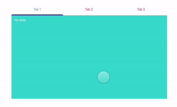
import React, { useCallback, useRef, useState } from "react";

import SwipeableWrapper from "react-swipeable-wrapper";

const tabs = ["Tab 1", "Tab 2", "Tab 3"];
const initialIndex = 0;

const styles = {
  parent: {
    maxWidth: 800,
    margin: "auto",
    paddingTop: "10em",
    overflow: "hidden",
  },
  text: {
    padding: "1em 2px",
    fontStyle: "bold",
  },
  slide: {
    padding: 15,
    minHeight: 400,
    color: "#fff",
  },
  slide1: {
    background: "#40E0D0",
  },
  slide2: {
    background: "#9FE2BF",
  },
  slide3: {
    background: "#FFBF00",
  },
  tabsParent: {
    width: "50%",
  },
  tabs: {
    display: "flex",
    justifyContent: "space-around",
    height: "2rem",
  },
  bottomBar: {
    height: "4px",
    borderTopRightRadius: "50px 20px",
    borderTopLeftRadius: "50px 20px",
    background: "#000080",
    width: `${100 / tabs.length}%`,
  },
  nonSelectedTab: {
    color: "#DE3163",
  },
  selectedTab: {
    color: "#000080",
  },
};

const App = () => {
  const swipeRef = useRef(null);
  const bottomBarRef = useRef(null);

  const [currentSlideIdx, setSlideIdx] = useState(initialIndex);

  const onTabClick = useCallback(currentIndex => {
    const { getCurrentIndex, swipeToIndex } = swipeRef?.current ?? {};
    const previousIndex = getCurrentIndex();
    if (currentIndex !== previousIndex) swipeToIndex(currentIndex);
  }, []);

  const handleSlideChange = currentIndex => {
    setSlideIdx(currentIndex);
  };

  return (
    <div>
      <div style={styles.parent}>
        <div style={styles.tabsParent}>
          <div style={styles.tabs}>
            {tabs.map((tab, idx) => (
              <div
                key={tab}
                onClick={() => onTabClick(idx)}
                style={
                  currentSlideIdx === idx
                    ? styles.selectedTab
                    : styles.nonSelectedTab
                }
              >
                {tab}
              </div>
            ))}
          </div>
          <div ref={bottomBarRef} style={styles.bottomBar} />
        </div>
        <SwipeableWrapper
          ref={swipeRef}
          initialIndex={initialIndex}
          onSlideChange={handleSlideChange}
          bottomBarRef={bottomBarRef}
        >
          <div style={{ ...styles.slide, ...styles.slide1 }}>1st slide</div>
          <div style={{ ...styles.slide, ...styles.slide2 }}>2nd slide</div>
          <div style={{ ...styles.slide, ...styles.slide3 }}>3rd slide</div>
        </SwipeableWrapper>
      </div>
    </div>
  );
};| Parameter | Type | Default | Description |
|---|---|---|---|
bottomBarRef |
React.RefObject<HTMLInputElement> |
null |
Ref applied on div that'll behave as bottom bar. |
onSlideChange |
function |
() => {} |
Each time a slide is changed, this function will be executed. |
initialIndex |
number |
0 |
Index of the slide to be displayed on the initial mount. |
filterNodes |
Array |
[] |
Node identifiers that will not accept swipes. |
transitionDuration |
number |
300 |
Duration of the transition. |
transitionTimingFunction |
string |
ease-out |
Timing function of the transition. |
containerStyles |
object |
{} |
Styles to override container styles. |
disableAutoScroll |
boolean |
false |
Disable auto scroll to top. |
disableAutoAdjustHeight |
boolean |
false |
Disable auto adjust height. |
swipeRef.current.swipeToIndex(indexOfSlide);const currentSlide = swipeRef.current.getCurrentIndex();This project is licensed under the terms of the MIT license.