Remove 'Node:' from card headers. #14
Conversation
|
What's the rationale for doing this? |
|
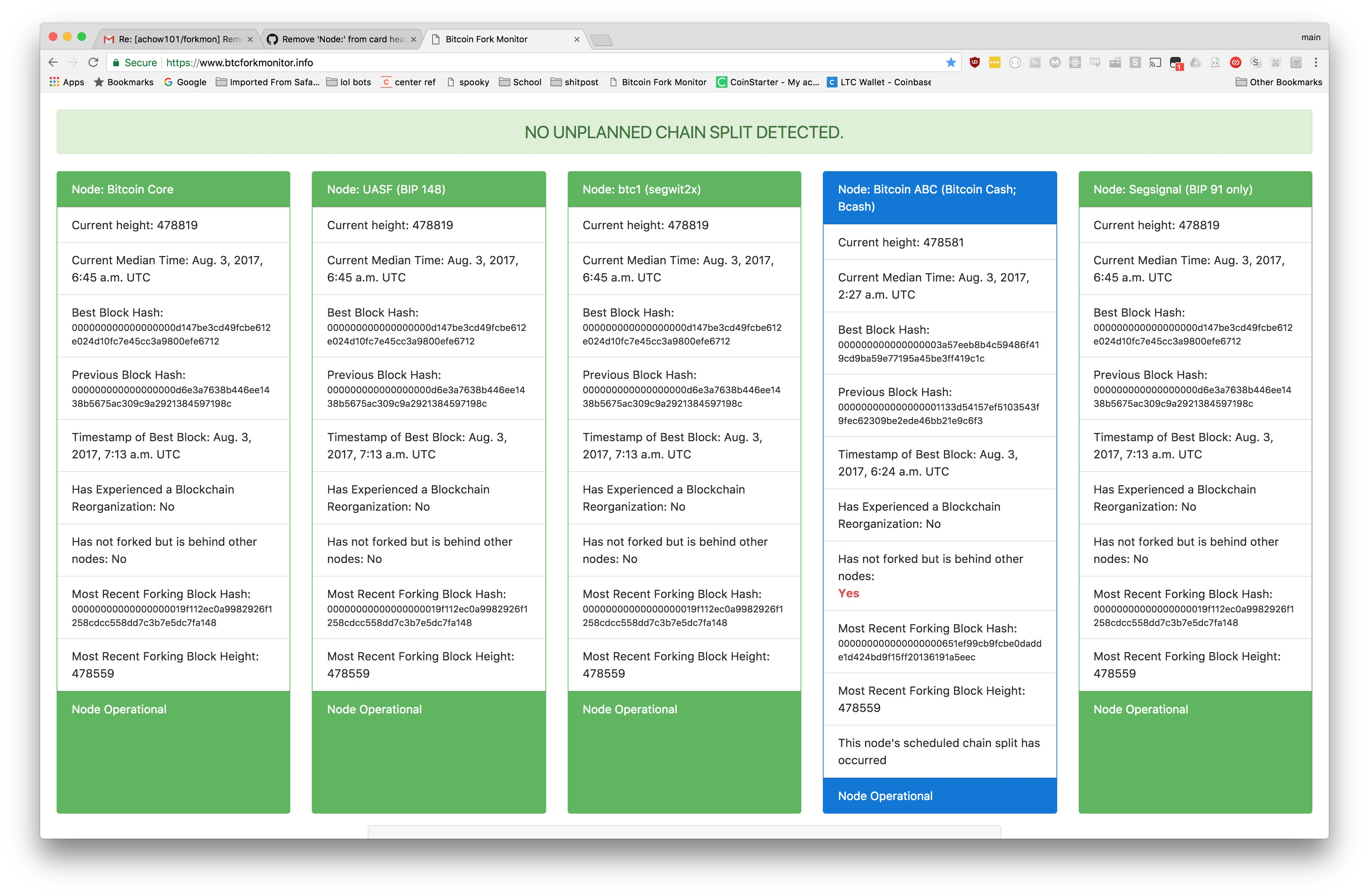
Not a big deal but "less" is more. The word "Node" in the top of the card is superfluous since at the bottom of the card it says "Node Operational" or "Node ..". Another solution is to have more of a header at the top of the web page which seems to have no header or intro explanation saying these are all the main nodes or discussed BIP/forks of Bitcoin - then "Node" is definitely not needed in the card header... Looks better without it (the code looks correct but there is a typo in the After comment about where btc1 still says Node btc1). |
|
Messed up my edits but my main reasoning for this at the time was because of scaling problems with certain display sizes and div height making the "Node Operational" green backgrounds stretch out except for the largest one as seen with Bitcoin Cash in the before image. Now that there is an extra column for scheduled forks, this horrendous layout error happens instead. |
|
It would be better if you could figure out how to line up the header and footers in the styling itself instead of changing the strings to make the styling match. |
|
I think each card looks too crowded and the info is repeated in each card could be put once on the left side of the page. Might require a bit of rework. Cross between card and table format [Questions..../Labels] Card 1 Card 2 Card 3 Card 4 And / Or put fewer cards in a row so that each card can be wider reducing line wraparound... |
Before
After