Language: English | 简体中文
An enhanced Excel-style table widget for Flutter with advanced features like cell merging, resizing, styling, and more. This package provides a powerful and customizable table component that can be used to create complex data layouts similar to Excel spreadsheets.
Custom table layouts can be created by customizing cells and cell styles, and custom functions can be implemented by extending ExcelController.
| Demo List |
|---|
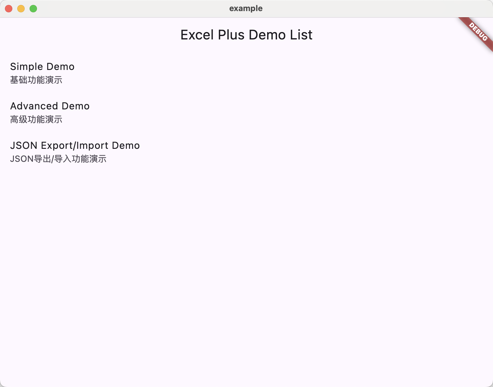 |
| Simple Demo |
|---|
 |
| Advanced Demo |
|---|
 |
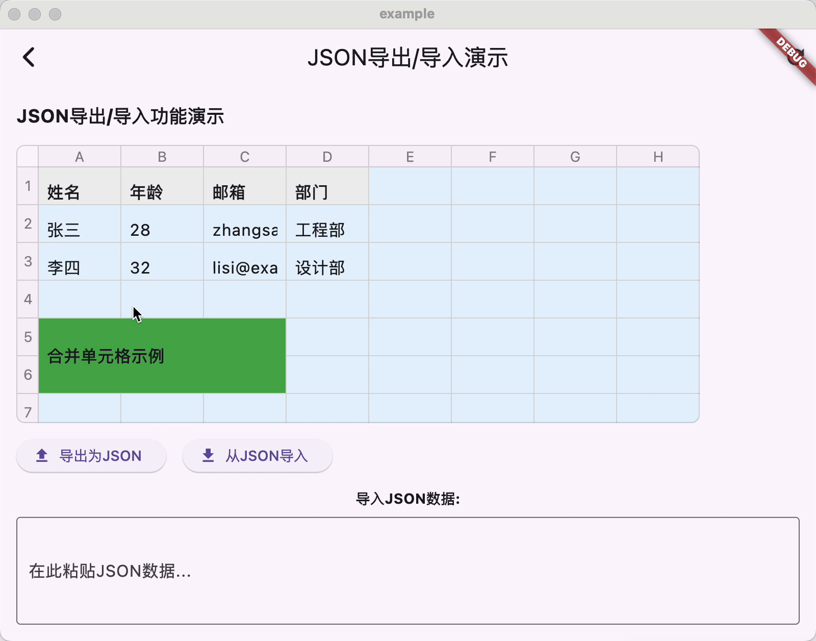
| JSON Export/Import Demo |
|---|
 |
| Template Demo |
|---|
 |
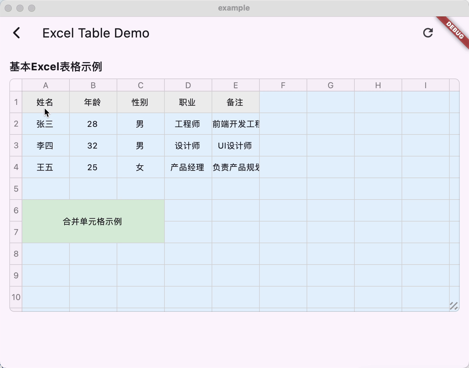
- Create tables with custom rows and columns
- Cell merging support
- Custom cell styling (colors, fonts, alignment, etc.)
- Read-only cell support
- Event callbacks for cell interactions
- Configurable cell dimensions (width and height)
- Resizable rows and columns
- Cell selection management
- Scrollable table view
- Custom cell builders for complete control
- Row and column headers (serial numbers)
- Customizable borders and rounded corners
- Custom cell model classes with JSON serialization support
- Export and import table data as JSON
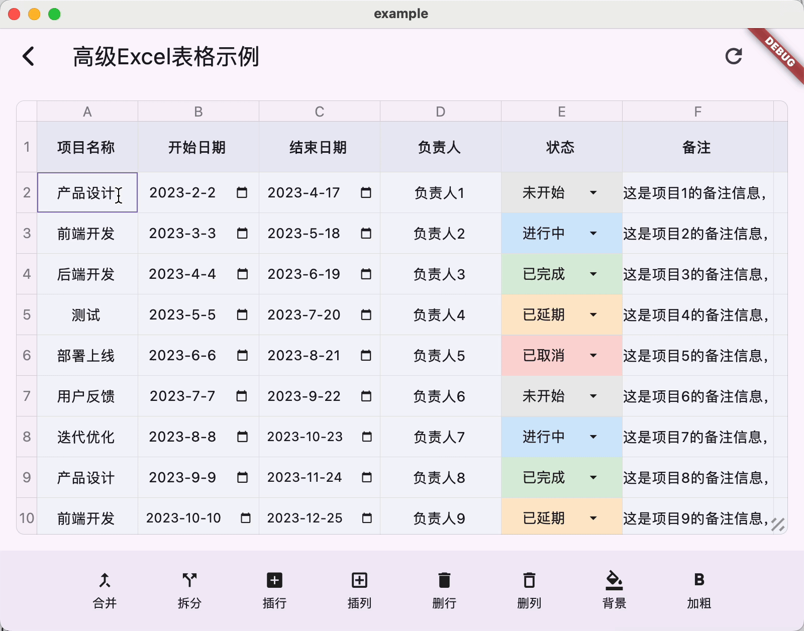
Based on the core features, developers can implement advanced capabilities such as:
- Multi-cell selection with drag support
- Insert/delete rows and columns
- Cell formatting (text, numbers, dates, dropdowns)
- Zoom/Scale functionality
- Undo/redo operations
- Complex cell types (dropdowns, date pickers, etc.)
dependencies:
  flutter:
    sdk: flutter

excel_table_plus: ^latest$ flutter pub getimport 'package:excel_table_plus/excel_table_plus.dart';ExcelController controller = ExcelController(
excel: ExcelModel(
x: 10,
y: 20,
showSn: true,
backgroundColor: Colors.white,
rowColor: Colors.blue.withOpacity(.25),
resizable: true,
borderRadius: 8.0,
),
items: [
// Header row
ExcelItemModel(
position: ExcelPosition(0, 0),
value: 'Name',
color: Colors.grey.shade200,
isReadOnly: true,
),
ExcelItemModel(
position: ExcelPosition(1, 0),
value: 'Age',
color: Colors.grey.shade200,
isReadOnly: true,
),
// Data cells
ExcelItemModel(
position: ExcelPosition(0, 1),
value: 'John Doe',
),
ExcelItemModel(
position: ExcelPosition(1, 1),
value: '30',
),
// Merged cells
ExcelItemModel(
position: ExcelPosition(0, 5),
value: 'Merged Cell Example',
color: Colors.green,
isReadOnly: true,
isMergeCell: true,
positions: [
ExcelPosition(0, 5),
ExcelPosition(1, 5),
ExcelPosition(2, 5),
ExcelPosition(0, 6),
ExcelPosition(1, 6),
ExcelPosition(2, 6),
],
),
],
);
FlutterExcelWidget(
controller: controller,
itemBuilder: (x, y, item) {
// Custom cell widget builder
if (item != null) {
return TextField(
controller: TextEditingController()..text = item.value?.toString() ?? '',
readOnly: item.isReadOnly,
decoration: const InputDecoration(
border: InputBorder.none,
contentPadding: EdgeInsets.all(8),
),
onChanged: (value) {
item.value = value;
},
);
}
return const SizedBox();
},
)The library supports custom cell model classes with JSON serialization. To properly export and import cell data as JSON, custom cell value classes must implement toJson() and fromJson() methods:
// Custom cell value class with JSON support
class CustomCellValue {
  String? value;
  final String cellType = 'custom_text';
  final TextEditingController controller;
  final TextAlign textAlign;
  final TextStyle? style;

  CustomCellValue({
    this.value,
    TextEditingController? controller,
    this.textAlign = TextAlign.start,
    this.style,
  }) : controller = controller ?? TextEditingController();

  // JSON serialization
  Map<String, dynamic> toJson() {
    final Map<String, dynamic> json = <String, dynamic>{};
    json['value'] = value;
    json['cellType'] = cellType;
    json['textAlign'] = textAlign.toString();
    // Serialize style if needed
    if (style != null) {
      json['style'] = {
        'fontSize': style!.fontSize,
        'color': style!.color?.value,
        // Add other style properties as needed
      };
    }
    return json;
  }

  // JSON deserialization
  factory CustomCellValue.fromJson(Map<String, dynamic> json) {
    TextAlign textAlign = TextAlign.start;
    // Parse textAlign from string
    String textAlignString = json['textAlign'] as String;
    // Add parsing logic based on your needs

    TextStyle? style;
    // Parse style if available
    if (json['style'] != null) {
      Map<String, dynamic> styleJson = json['style'] as Map<String, dynamic>;
      style = TextStyle(
        fontSize: styleJson['fontSize'] as double?,
        color: styleJson['color'] != null ? Color(styleJson['color'] as int) : null,
        // Add other style properties as needed
      );
    }

    return CustomCellValue(
      value: json['value'] as String?,
      textAlign: textAlign,
      style: style,
    );
  }
}

// Using custom cell model in ExcelItemModel
ExcelItemModel(
  position: ExcelPosition(0, 0),
  value: CustomCellValue(value: 'Custom Cell Value'),
  cellType: 'custom_text', // Specify cell type for proper serialization
)The library supports exporting the entire table data as JSON and importing it back. When importing, you need to provide a factory function to create custom cell values based on their type:
// Export table data to JSON
Map<String, dynamic> exportTableData() {
  return {
    'excel': controller.excel.toJson(),
    'items': controller.items.map((item) => item.toJson()).toList(),
  };
}

// Import table data from JSON
void importTableData(Map<String, dynamic> json) {
  ExcelModel excel = ExcelModel.fromJson(json['excel'] as Map<String, dynamic>);
  List<ExcelItemModel> items = (json['items'] as List<dynamic>)
      .map((itemJson) => ExcelItemModel.fromJson(
            itemJson as Map<String, dynamic>,
            customValueFactory: (cellType, valueJson) {
              // Create custom cell values based on their type
              switch (cellType) {
                case 'custom_text':
                  return CustomCellValue.fromJson(valueJson);
                // Add more cases for other custom cell types
                default:
                  return valueJson;
              }
            },
          ))
      .toList();

  controller = ExcelController(
    excel: excel,
    items: items,
  );
}Main configuration for the Excel table:
x- Number of columnsy- Number of rowsitemWidth- Default column widthitemHeight- Default row heightcustomColumnWidths- Custom widths for specific columnscustomRowHeights- Custom heights for specific rowsselectedBorderWidth- Selected cell border widthselectedBorderColor- Selected cell border colordividerWidth- Width of cell dividersborderWidth- Table border widthborderRadius- Corner radius for the tableborderColor- Table border colorrowColor- Background color for rowscolumnColor- Background color for columnsbackgroundColor- Table background colordividerColor- Divider colorintersectionColor- Intersection color of horizontal and vertical linesisReadOnly- Whether the table is read-only. When set to read-only, the isReadOnly property of cells will be invalidisEnableMultipleSelection- Whether to enable multiple selectionshowSn- Show/hide serial numberssn- Serial number configurationalignment- Alignmentresizable- Enable/disable resizing functionalityresizeAreaSize- Resize area size (in pixels)
Represents a cell in the table:
position- Cell position (x, y)value- Cell value (can be any type)isMergeCell- Whether this is a merged cellpositions- All positions in a merged cellcellType- String identifier for custom cell model typescolor- Cell background colorisReadOnly- Whether cell is read-only
Controller for managing table state and operations:
- Provides methods for table manipulation
- Manages cell selection state
- Handles cell merging operations
- Enables event callback registration
- Supports finding items at specific positions
- Supports inserting and deleting rows and columns
- Supports multiple selection and range selection
- Supports resizing rows and columns
The package includes comprehensive examples demonstrating various implementations:
- Simple Demo - Basic usage with simple data
- Advanced Demo - Complex usage with different cell types (text, number, date, dropdown)
- JSON Export/Import Demo - Demonstrates exporting and importing table data with custom cell models
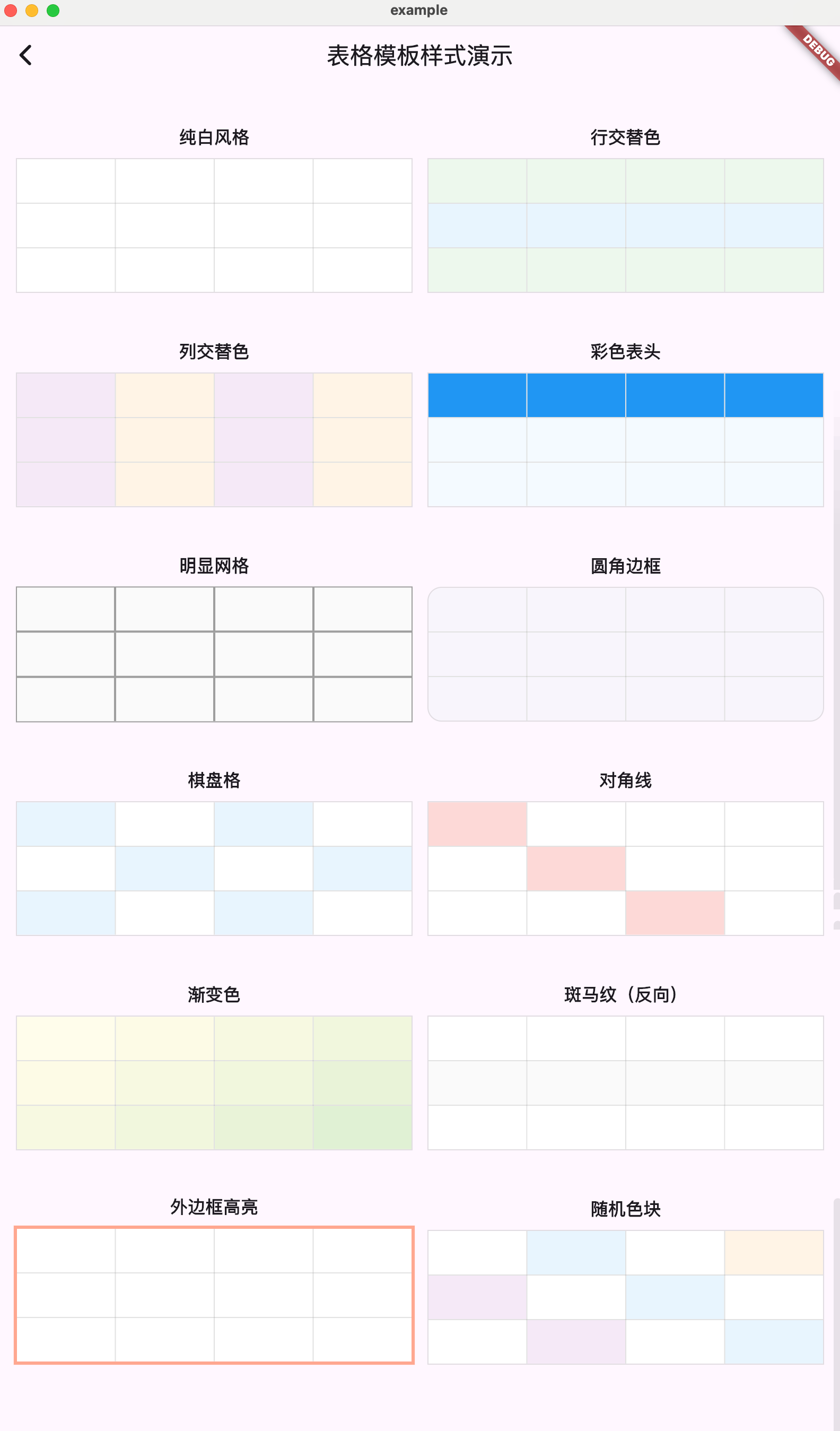
- Template Demo - Various table style template examples
Run the example project:
cd example
flutter runContributions are welcome! Feel free to submit issues and pull requests.
This project is licensed under the MIT License - see the LICENSE file for details.