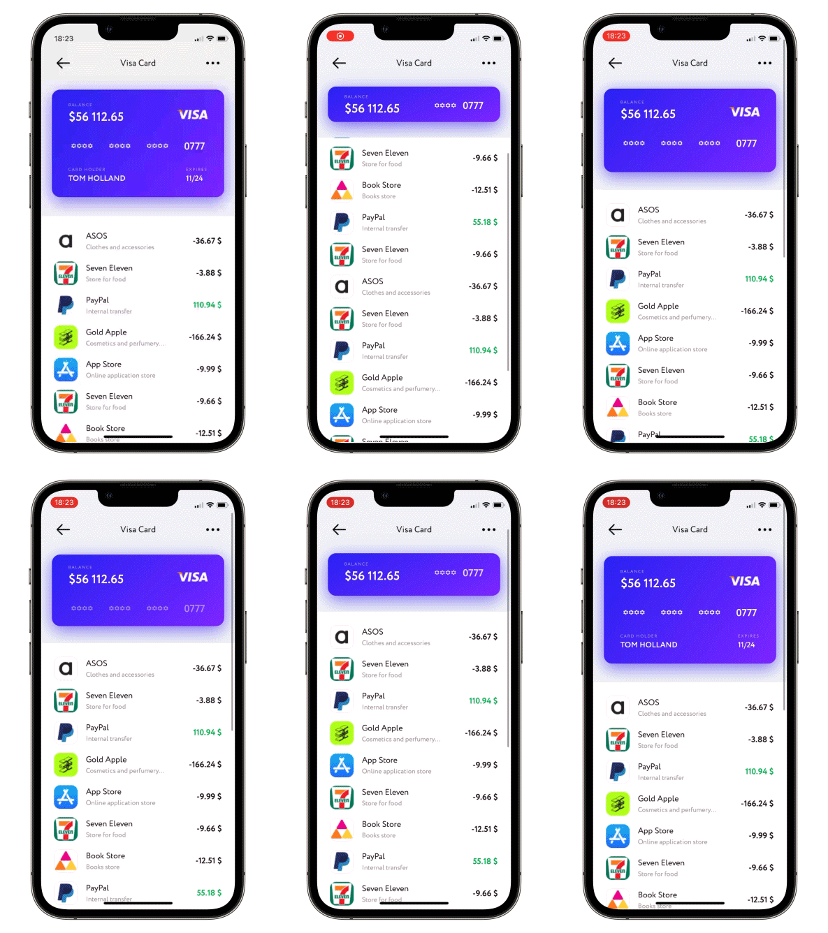
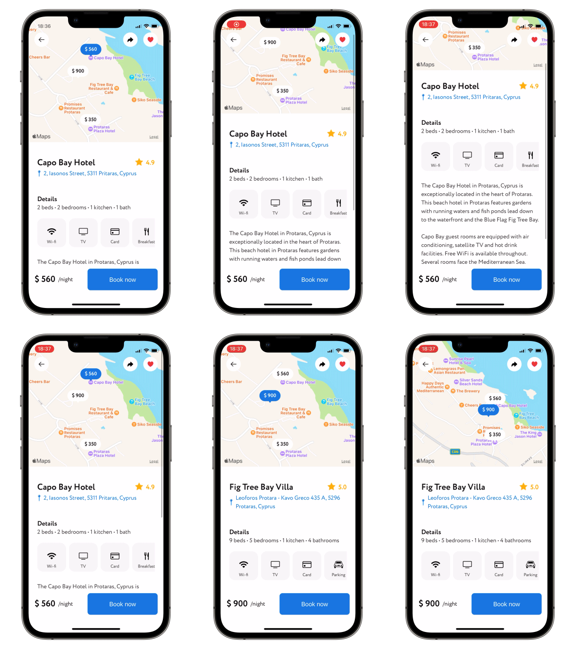
- Put your header and content bodies code into a ScalingHeaderScrollView constructor.
- Set the necessary modifiers, see below.
struct ContentView: View {

    var body: some View {
       ScalingHeaderScrollView {
            ZStack {
                Rectangle()
                    .fill(.gray.opacity(0.15))
                Image("header")
            }
        } content: {
            Text("↓ Pull to refresh ↓")
                .multilineTextAlignment(.center)
                .padding()
        }
    }
}Please note that ScalingScrollview is just a ScrollView under the hood, so it works very similar to it. If content's height changes between tabs inside the scroll view, there is no way to keep scroll position nice and stable. Usually when using a TabView, you put separate ScrollViews on every tab, not the other way around. And if you were to put a TabView inside a ScrollView, it wouldn't work as you expect, and neither will putting it inside a ScalingScrollview.
Moreover, TabView gives almost no control over itself (getting/setting its current position, getting tab's content height, etc.), so there is no way to manually mess with its scrollOffset, which is what this library relies heavily upon.
header - @ViewBuilder for your header
content - @ViewBuilder for your content
passes current collapse progress value into progress binding: 0 for not collapsed at all, 1 - for fully collapsed
.collapseProgress(_ progress: Binding<CGFloat>)allows to set up callback for ScrollView reaching the bottom
.scrollViewDidReachBottom(perform: @escaping () -> Void)allows to set up callback and isLoading state for pull-to-refresh action
.pullToRefresh(isLoading: Binding<Bool>, perform: @escaping () -> Void)allows to set up callback and isLoading state for pull-to-load-more action
.pullToLoadMore(isLoading: Binding<Bool>, perform: @escaping () -> Void)allows content scroll reset, need to change Binding to true
.scrollToTop(resetScroll: Binding<Bool>)allows to change current header height, need to change state, possible values are .collapsed, .expanded or .custom(CFGloat)
.snapHeaderToState(state: Binding<SnapHeaderState?>, animated: Bool)changes min and max heights of Header, default min = 150.0 and max = 350.0
.height(min: CGFloat = 150.0, max: CGFloat = 350.0)when scrolling up - switch between actual header collapse and simply moving it up (by default moving up)
.allowsHeaderCollapse()when scrolling down - enable (disabled by default) header scale
.allowsHeaderGrowth()Enable/disable (disabled by default) header snap. Available modes:
.disabled- Disable header snap..immediately- Once you lift your finger header snaps either to min or max height automatically..afterFinishAccelerating- At the end of scroll view deceleration the header snaps either to min or max height automatically.
.setHeaderSnapMode(.immediately)Set custom positions for header snap (explained previous point). Specify any amount of values in 0...1 to set snapping points, 0 - fully collapsed header, 1 - fully expanded
.headerSnappingPositions(snapPositions: [CGFloat])Set custom initial position to which scroll view will be automatically snapped to. Specify a value in 0...1, 0 - fully collapsed header, 1 - fully expanded
.initialSnapPosition(initialSnapPosition: CGFloat)hide scroll indicators (false by default)
.hideScrollIndicators()To try the ScalingHeaderScrollView examples:
- Clone the repo
https://github.com/exyte/ScalingHeaderScrollView.git - Open
ScalingHeaderScrollViewExample.xcodeprojin the Xcode - Try it!
dependencies: [
    .package(url: "https://github.com/exyte/ScalingHeaderScrollView.git")
]- iOS 14+
- Xcode 12+
PopupView - Toasts and popups library
AnchoredPopup - Anchored Popup grows "out" of a trigger view (similar to Hero animation)
Grid - The most powerful Grid container
AnimatedTabBar - A tabbar with a number of preset animations
MediaPicker - Customizable media picker
Chat - Chat UI framework with fully customizable message cells, input view, and a built-in media picker
OpenAI Wrapper lib for OpenAI REST API
AnimatedGradient - Animated linear gradient
ConcentricOnboarding - Animated onboarding flow
FloatingButton - Floating button menu
ActivityIndicatorView - A number of animated loading indicators
ProgressIndicatorView - A number of animated progress indicators
FlagAndCountryCode - Phone codes and flags for every country
SVGView - SVG parser
LiquidSwipe - Liquid navigation animation


