
Build lightning fast web forms from JSON.
❤️ Conditional logic
❤️ Flexible validation
❤️ Infinite depth
❤️ Rehydratable
While other libraries might utilize react-redux, refs, or Context for form state management, react-json-form-engine relies on React as little as possible, and offloads its core logic to plain JavaScript, while utilzing mobx bindings for rendering. The result is scalable, lightning-fast performance with neglible reliance on the React lifecycle.
It's important to note that this library was designed to manage large, multi-section forms, that may contain conditional logic (e.g. Show field Foo based on the response given in field Bar). This may or may not be for you, but it can also handle simple forms with extreme ease.
It also offers a mechanism for serializing all form responses to JSON for persistence. The reverse also stands, as any form can be easily rehydrated from historical data, and returned to its previous state.


https://mikechabot.github.io/react-json-form-engine-storybook/
Requires React 15.0.0+
$ npm install --save react-json-form-engine
Note: This library renders Bulma semantics; you'll need to import the styles for everything to look nice.
// Import the styles
import 'react-json-form-engine/dist/css/styles.min.css';

// Import the API
import { Form, FormEngine } from 'react-json-form-engine';To run the react-json-form-engine storybook locally:
$ git clone https://github.com/mikechabot/react-json-form-engine.git
$ npm install
$ npm run storybook
Available at http://localhost:6006/
First, let's import the API:
import { Form, FormEngine } from 'react-json-form-engine';Next, we'll need to build a Form Definition, which is the skeleton structure that describes how the form should look and behave. The definition must adhere to a strict schema, and can be represented as a JavaScript object or a JSON Schema. But don't worry about the details yet, we'll get into those.
Once we've built our definition, we'll feed it to the FormEngine, which returns an instance:
const instance = new FormEngine(definition);To rehydrate a form instance from a previous state, we'd pass in our model as the second argument.
const model = {username: 'mikechabot', city: 'Boston', state: 'MA'};
const instance = new FormEngine(definition, model);
Then, we just pass the instance to the <Form /> component, and react-json-form-engine takes care of the rest:
<Form
  instance={instance}
  onUpdate={(id, value) => {}}
  onSubmit={(hasError) => {}}
/>Let's create a simple login form. Either follow along below, or check out the Login demo on storybook.
Here's our definition, which is a rather simple one. It consists of just a single section with a single subsection, which houses three fields. Note, we're also using a Field Decorator to ensure user_pass renders as a password field:
const loginForm = {
  id: 'loginForm',
  title: 'Welcome to Foo!',
  sections: [
    {
      id: 'loginSection',
      title: 'Login Section',
      subsections: [
        {
          id: 'loginSubsection',
          title: 'Login',
          subtitle: 'Please enter your credentials.',
          fields: [
            {
              id: 'username',
              title: 'Username',
              type: 'string',
              required: true
            },
            {
              id: 'password',
              title: 'Password',
              type: 'string',
              required: true
            },
            {
              id: 'rememberMe',
              title: 'Remember me',
              type: 'boolean'
            }
          ]
        }
      ]
    }
  ],
  decorators: {
    password: {
      component: {
        type: 'password'
      }
    }
  }
};
Now that we have our definition, let's create an instance of FormEngine:
const instance = new FormEngine(loginForm); With the instance in hand, we can pass it our <Form /> component:
const LoginForm = () => (
  <Form
    instance={instance}
    onUpdate={(id, value) => {
       // Do stuff
    }}
    onSubmit={hasError => {
       // Do stuff
    }}
  />
);
And once filled out, onSubmit will get us the form responses, and also pass along the state of the form
const LoginForm = () => (
  <Form
    instance={instance}
    onUpdate={(id, value) => {
       // Log the change set
       console.log(`FieldId ${id} was changed to ${value}`);

       // Get the full validation results of the field
       console.log(instance.getValidationResultById(id);

       // Get just the validation status of the field (i.e. ERROR, OK)
       console.log(instance.getValidationStatusById(id);
    }}
    onSubmit={hasError => {
      if (hasError) {
        // Get form validation results
        console.log(intance.getValidationResults(id));
      }
      // Get form responses
      console.log(instance.getModel());

      // Serialize form responses
      console.log(instance.serializeModel());
    }}
  />
);- Form Definition
- Form Props
- Field Definition
- Field Type
- Field Children
- Field Options
- Field Props
- Field Type Transitions
- Field Decorators
Form definitions adhere to a strict schema. They must contain at least one section, which contains at least one subsection, which contains at least one Field Definition. You may find this schema verbose for smaller forms, however its purpose is to scale for significantly complex forms.
View the full schema in the FormAPIService
In forms with a single section, vertical tabs are not displayed. In sections with a single subsection, horizontal tabs are not displayed. See the Layout demos on storybook.
// The most minimal form possible
export default {
  id: <string>,
  title: <string>,
  faIcon: {
      name: <string>,
      prefix: <string>
  },
  sections: [
    {
      id: <string>,
      title: <string>,
      subsections: [
        {
          id: <string>,
          title: <string>,
          fields: [
            {
                ...
            }
          ]
        }
      ]
    }
  ]
};
The
faIconobject is optional on the form definition; it supports Font Awesome icons.
Have a look the Simple Form demo on storybook.
Don't worry about making mistakes with your definition. If the FormEngine is instantiated with a malformed definition, the UI will be notified of the failure location.
In the case below, our definition was missing the sections array:
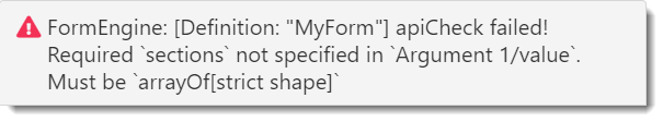
Have a look at the Malformed Form demo on storybook.
| Prop | Required? | Type | Description |
|---|---|---|---|
instance |
Yes | object |
Created by new FormEngine(definition) |
onSubmit |
Yes | func |
Invoked when Submit is clicked. Is passed with hasError, which is the overall status of the form |
onUpdate |
No | func |
Invoked when the user updates the form. Is passed with the id and value of the field that was updated |
submitButtonLabel |
No | string |
Custom label for the "Submit" button. |
hideFormTitle |
No | boolean |
Hide the form's title |
hideFormBorder |
No | boolean |
Hide the form's border |
hideSubsectionTitles |
No | boolean |
Hide subsection titles. Only applies to sections with a single subsection** |
hideSubsectionSubtitles |
No | boolean |
Hide subsection subtitles |
width |
No | number or string |
Apply a width to the form |
** Section titles are only used in multi-section forms, and are used as the label for vertical tabs. Subsection titles are displayed as a heading in sections that contain a single subsection, and as labels for horizontal tabs in sections that are multi-subsection. See the Layout demo on storbyook, and tinker with the prop knobs to see this behavior in action.
Field definitions also adhere to a strict schema. At minimum, they must contain an id, type and title:
// The most minimal field object
{
  id: <string>,       // Uniquely identifies the field within the DOM, and FormEngine instance
  type: <string>,     // Determines the data type of the field response
  title: <string>     // Label of the field
}Determines the data type of the response value stored in the model, and which Default Control to render. To override the default and render an Allowed Control instead, use a Field Decorator.
Note, the info field is the only field type that does not accept input from the end-user; its purpose is to provide a place for the form author to render informational content, such as instructions, to the end-user. This field type utilizes dangerouslySetInnerHTML meaning you're able to render pure HTML. Be aware of XSS concerns.
| Field Type | Default Control | Allowed Controls | Supports options? |
|---|---|---|---|
string |
<Text /> |
<Password />, <Textarea />, <Select />, <Radio /> |
Yes** |
boolean |
<Checkbox /> |
<Radio /> |
Yes** |
number |
<Number /> |
<Range /> |
No |
array |
<Select /> |
<Checkboxgroup /> |
Yes |
date |
<DateTime /> |
N/A | No |
info** |
<section /> |
N/A | No |
** Some field types will automatically transition from their Default Control to another Allowed Control if an
optionsarray is present in the field definition. (See Field Type Transitions). However, in most cases, you must use a Field Decorator to use another Allowed Control.
Any field can contain child fields. Simply create a fields array on the field, and drop in valid Field Definitions. Here's an example of some nested fields, but take a look at the Nesting demo on storybook.
Note: Field children can recurse infinitely, and also be placed on Field Options.
{
  id: 'parent',
  type: 'number',
  title: 'Parent',
  fields: [
    {
      id: 'child',
      type: 'string',
      title: 'Child',
      fields: [
        {
          id: 'grandchild',
          type: 'number',
          title: 'Grandchild'
        }
      ]
    },
    {
      id: 'child-2',
      type: 'array',
      title: 'Child',
      options: [
        { id: 'op1', title: 'Option 1'},
        { id: 'op2', title: 'Option 2' },
      ]
    }
  ]
}
Have a look at the Nested Fields demo on storybook.
Applies to
string,boolean, andarrayfield types only.
Fields of type boolean only accept a maximum of two options; each of which should contain just a title property. The first option is considered the affirmative response:
{
  id: 'my_bool',
  title: 'How often does it occur?',
  type: 'boolean',
  options: [
    { title: 'Always' },
    { title: 'Never' },
  ]
}For field types that accept unlimited options (string, array), you must include both an id and title. The ids of the selected option(s) are stored in the model.
{
  id: 'my_arr',
  title: 'Pick some',
  type: 'array',      // Array type allows for multiple selections
  options: [
    { id: 'op1', title: 'Option 1' },
    { id: 'op2', title: 'Option 2' },
    { id: 'op3', title: 'Option 3' },
  ]
},
{
  id: 'my_str',
  title: 'Pick one',
  type: 'string',    // String type allows for single selection
  options: [
    { id: 'op1', title: 'Option 1' },
    { id: 'op2', title: 'Option 2' },
    { id: 'op3', title: 'Option 3' },
  ]
}For field controls that render selectable options, like <Radio /> or <Checkboxgroup />, you can include Field Children on any of the options. Take a look at the Complex Nesting demo on storybook.
{
  id: 'field_2',
  type: 'string',
  title: 'Select One (Field Type: String)',
  options: [
    {
      id: 'op1',
      title: 'Option 1',
      fields: [{ id: 'explain_1', type: 'string', title: 'Explain' }]
    },
    {
      id: 'op2',
      title: 'Option 2',
      fields: [{ id: 'explain_2', type: 'string', title: 'Explain' }]
    },
    {
      id: 'op3',
      title: 'Option 3',
      fields: [{ id: 'explain_3', type: 'string', title: 'Explain' }]
    }
  ]
}Here's the complete list of props that can be passed to Field Definitions:
| Property | Type | Required | Description |
|---|---|---|---|
id |
string |
Yes | See Field ID |
type |
string |
Yes | See Field Type |
title |
string |
Yes | Display label for the field |
options |
array |
No | See Field Options |
fields |
array |
No | See Field Children |
placeholder |
string |
No | Placeholder text to display |
showCondition |
object |
No | Condition object (See Conditions) |
required |
boolean |
No | Whether the field is required (See Validation) |
pattern |
string |
No | Pattern to match during validation (See Validation) |
min |
number |
Yes* | Minimum value. (Used for number field types) |
max |
number |
Yes* | Maximum value. (Used for number field types) |
showTimeSelect |
boolean |
No | Only show Date in Date/Time. (Used for date field types) |
hideCalendar |
boolean |
No | Only show Time in Data/Time. (Used for date field types) |
content |
string |
No | Informational content to be displayed to the end-user. Utilizes dangerouslySetInnerHTML. (Used for info field types) |
minandmaxare only required for<Range />component types.
datefield types implement react-datepicker. Any prop that can be passed toreact-datepickercan be added to adatefield, and it will be passed directly to<Date />, such astimeIntervals, ordateFormat.
By default, a string field is rendered as <Text /> (See Field Type), but with options it automatically renders as a <Select />.
{
  // Renders as <Text />
  id: 'field_1',
  type: 'string',
  title: 'Text Field'
},
{
  // Renders as <Select />
  id: 'field_2',
  type: 'string',
  title: 'Select Field',
  options: [
    { id: "op1", title: "Option 1" },
    { id: "op2", title: "Option 2" },
  ]
}
Have a look at the Strings demo on storybook.
By default, a boolean field is rendered as <Checkbox /> (See Field Type), but with options it automatically renders as a <Radio />.
{
  id: "field_1",
  type: "boolean",
  title: "Checkbox Field"
},
{
  id: "field_2",
  type: "boolean",
  title: "Radio Field",
  options: [
    { title: "Yes" },
    { title: "No" }
  ]
}
A maximum of two (2) options is allowed for
booleanfields. For unlimited<Radio />options, use thestringtype with acomponentofradio.
Have a look at the Booleans demo on storybook.
Field decorators contain metadata about the fields you've configured in your form definition. Add the decorators object to the root of the Form Definition:
{
  id: 'my_form'
  title: 'My Form',
  sections: [...],
  decorators: {}
}
The decorators object will be keyed by Field ID, and can contain the properties hint and component.
Add hint text to any field:
{
  id: "Form_ID",
  title: "Form Title",
  sections: [{
    ...
    subsections: [{
      ...
      fields: [{
        id: "field_1",
        type: "string",
        title: "Field title"
      }]
    }]
  }],
  decorators: {
    field_1: {
      hint: "This is some hint text!"   // Add hint text to any field
    }
  }
}Every field type renders a Default Control (See Field Type), however you'll often want to explicitly override the default component type in favor of another. In some cases, this occurs automatically (See Field Type Transitions), however most times you'll need to specify a component decorator.
Let's update field_1 from a <Select /> to a <Checkboxgroup />:
{
  id: "Form_ID",
  title: "Form Title",
  sections: [{
    ...
    subsections: [{
      ...
      fields: [{
        id: "field_1",
        type: "array",
        title: "Field title",
        options: [
           ...
        ]
      }]
    }]
  }],
  decorators: {
    field_1: {
      hint: 'More hint text!',
      component: {
        type: 'checkboxgroup'   // Override the default component type
      }
    }
  }
}
Here's a list of field types with overrideable components:
| Field Type | Component Decorator Overrides |
|---|---|
string |
password, textarea, radio |
number |
range |
array |
checkboxgroup |
Take a look at a component override in the Arrays demo.
Easily serialize the form's responses by calling serializeModel on the instance:
const json = instance.serializeModel();To access the model without serialization, use the below:
const map = instance.getModel();           // {fooId: 'bar', bazId: 'qux'}
const array = instance.getModelAsArray(); // [{fooId: 'bar'}, {bazId: 'qux'}]Three types of validation are supported:
| Type | Supported Data Types |
|---|---|
| Required | All |
| Numeric (min/max) | number |
| Regular Expression | string, number |
Take a look at the Validation demos on storybook.
Add required: true to any field definition:
{
  id: 'username',
  type: 'string',
  title: 'Username',
  required: true
},
{
  id: 'myOptions',
  type: 'array',
  title: 'Option Group',
  required: true,
  options: [
    { id: 'op1', title: 'Option 1' },
    { id: 'op2', title: 'Option 2' },
    { id: 'op3', title: 'Option 3' },
    { id: 'op4', title: 'Option 4' }
  ]
}
Note: Fields are only validated if they are visible in the DOM. For instance, if a field's
showCondition(See Conditions) is not met, it will not be displayed to the end-user; conditionally hidden fields are not validated.
Take a look at the Required Validation demo in storybook.
Add min: <number> or max: <number> or both to any number type field:
{
  id: 'age',
  type: 'number',
  title: 'Age',
  min: 0,
  max: 120
}
Note
min/maxvalues are only validated once the field is marked as dirty, that is, the user inputs a value.
Take a look at the Numeric Validation demo on storybook.
Add pattern: <regex> to any string or number field:
{
  id: 'myRegEx',
  type: 'string',
  title: 'My Field',
  pattern: '^foobar$',
}
Take a look at the Regex Demo on storybook.
Validators can be combined. The following number field will only pass validation if the following conditions are met:
- The value is not
undefined, perrequired. - The value is greater-than or equal to zero, per
min. - The value is less-than or equal to 300, per
max. - The value starts with the numeral
3, perpattern.
{
  id: 'num1',
  type: 'number',
  title: 'Number Regex',
  pattern: '^3',
  required: true,
  min: 0,
  max: 300
}Conditionally show any field by giving it a showCondition. Take a look at the Conditions demos before moving on.
{
  id: 'myString',
  type: 'string',
  title: 'Conditional Field',
  showCondition: {...}
}
A showCondition contains a type and one or more expressions, which also contain a type. Expressions are evaluated against one another, or the form model itself to conditionally show a field (e.g. Show field Foo based on the response given in field Bar).
Note:
showConditionsalso accept anotproperty, and if set totrue, the condition will be negated.
| Type | Data Types | Description |
|---|---|---|
BETWEEN |
number |
Determine if a FORM_RESPONSE is between a CONST value |
BLANK |
string, array, date |
Determine if a FORM_RESPONSE is blank** |
CONTAINS |
array |
Determine if a FORM_RESPONSE contains a CONST value |
EMPTY |
string, array, date |
Determine if a FORM_RESPONSE is empty*** |
EQUAL |
string number, date, boolean |
Determine if a FORM_RESPONSE is equal to a CONST |
GREATER_THAN |
number |
Determine if a FORM_RESPONSE is greater than a CONST |
LESS_THAN |
number |
Determine if a FORM_RESPONSE is less than a CONST |
**
BLANKis defined as an empty array or string, undefined, or null.
***
EMPTYimplements Lodash's isEmpty
| Type | Uses |
|---|---|
CONST |
A constant value |
FORM_RESPONSE |
References a field id in the form instance |
showConditionsare evaluated every time the form is updated.
Take a look at the Conditions demos for live examples.
The following checkboxgroup has three option fields. The second option has a child field; if this option is selected, a string field is rendered underneath it.
Have a look at the field definition below, and then we'll walk through it.
{
  id: 'myArray',
  type: 'array',
  title: 'Select some options to display the children',
  options: [
    {
      id: 'option1',
      title: 'Option 1'
    },
    {
      id: 'option2',
      title: 'Option 2',
      fields: [
        {
          id: 'myString',
          type: 'string',
          title: 'Conditional Field',
          showCondition: {
            type: 'CONTAINS',
            expressions: [
              {
                type: 'FORM_RESPONSE',
                id: 'myArray'
              },
              {
                type: 'CONST',
                value: 'option2'
              }
            ]
          }
        }
      ]
    },
    {
      id: 'option3',
      title: 'Option 3',
    }
  ]
}
The showCondition on the myString field can appear cryptic, but let's take a closer look at it:
showCondition: {
  type: 'CONTAINS',
  expressions: [
    {
      type: 'FORM_RESPONSE',
      id: 'myArray'
    },
    {
      type: 'CONST',
      value: 'option2'
    }
  ]
}
The condition is of type CONTAINS, and contains an array of expressions.
- One
expressionis of typeFORM_RESPONSEand references byidthe fieldmyArray. - One
expressionis of typeCONST, and contains the valueoption2.
The expression-service will pull the value of myArray from the instance, and determine if the CONST value of option2 is contained within in. If so, myString will be displayed.
At its core, this
showConditionsays "ShowmyStringif the user selectedoption2in themyArrayfield."
If the user selects all three options for myArray, its form response value in the instance would be ["option1", "option2", "option3"], therefore myString would be shown since the value in the CONST expression (option2) is contained within the the form response.
Let's take a look at an EMPTY example. We'll use the same checkboxgroup field from the condition example above, however in this case, the conditional field (myNumber) won't be rendered under an option field, but rather under the entire field itself regardless of which option is selected.
Have a look at the field definition below, and then we'll walk through it.
{
  id: 'myArray',
  type: 'array',
  title: 'Select some options to display the children',
  options: [
    {
      id: 'option1',
      title: 'Option 1'
    },
    {
      id: 'option2',
      title: 'Option 2',
    },
    {
      id: 'option3',
      title: 'Option 3',
    },
  ],
  fields: [
    {
      id: 'myNumber',
      type: 'number',
      title: 'Number Field',
      showCondition: {
        type: 'EMPTY',
        not: true,
        expression: {
            type: 'FORM_RESPONSE',
            id: 'myArray'
        }
      }
    }
  ]
}
Let's pull out the showCondition and take a closer look:
showCondition: {
  type: 'EMPTY',
  not: true,
  expression: {
      type: 'FORM_RESPONSE',
      id: 'myArray'
  }
}
The condition is of type EMPTY, contains a single expression, and also the not flag for negation.
- The
expressionis of typeFORM_RESPONSEand references byidthe fieldmyArray. - The
notflag will negate theEMPTYcondition being evaluated.
The expression-service will pull the value of myArray from the instance, and determine if it is not empty. If so, the myNumber field will be displayed.
At its core, this expression says "Show
myNumberif the user selected any of the options inmyArray"
Conversely, if the not flag was removed from the condition, the myNumber field would immediately display to the user, but would be conditionally hidden if the user selected any of the options in myArray.
Let's take a look at a GREATER_THAN example. The number field below (myNumber) has a single conditional child field, which will be displayed based based on the value input into myNumber.
Have a look at the field definition below, and then we'll walk through it.
{
  id: 'myNumber',
  type: 'number',
  title: 'Greater-Than (>)',
  min: 0,
  max: 10,
  fields: [
    {
      id: 'myString',
      type: 'string',
      title: 'Field',
      showCondition: {
        type: 'GREATER_THAN',
        expressions: [
          {
            type: 'FORM_RESPONSE',
            id: 'myNumber'
          },
          {
            type: 'CONST',
            value: 5
          }
        ]
      }
    }
  ]
}
Let's pull out the showCondition and take a closer look:
showCondition: {
  type: 'GREATER_THAN',
  expressions: [
    {
      type: 'FORM_RESPONSE',
      id: 'myNumber'
    },
    {
      type: 'CONST',
      value: 5
    }
  ]
}
The condition is of type GREATER_THAN, and contains an array of expressions.
- One
expressionis of typeFORM_RESPONSEand references byidthe fieldmyNumber. - One
expressionis of typeCONST, and contains the value5.
The expression-service will pull the value of myNumber from the instance, and determine if it is greater than 5. If so, the myString field will be displayed.
At its core, this expression says "Show
myStringifmyNumberis greater than 5."
Let's take a look at a BETWEEN example. The following range field (myNumber) has a min/max of 0 and 100 respectively, and also contains a single conditional child field, which will be displayed when the value of myNumber is between 25 and 75.
{
  id: 'myNumber',
  type: 'number',
  title: 'Between 25 and 75',
  min: 0,
  max: 100,
  fields: [
    {
      id: 'myString',
      type: 'string',
      title: 'Field',
      showCondition: {
        type: 'BETWEEN',
        expressions: [
          {
            type: 'FORM_RESPONSE',
            id: 'myNumber'
          },
          {
            type: 'CONST',
            value: [25, 75]
          }
        ]
      }
    }
  ]
}
Let's pull out the showCondition and take a closer look:
showCondition: {
  type: 'BETWEEN',
  expressions: [
    {
      type: 'FORM_RESPONSE',
      id: 'myNumber'
    },
    {
      type: 'CONST',
      value: [25, 75]
    }
  ]
}
The condition is of type BETWEEN, and contains an array of expressions.
- One
expressionis of typeFORM_RESPONSEand references byidthe fieldmyNumber. - One
expressionis of typeCONST, and contains an array of values.
The expression-service will pull the value of myNumber from the instance, and determine if it is between 25 and 75. If so, the myString field will be displayed.
At its core, this expression says "Show
myStringifmyNumberis between 25 and 75."
Note that the CONST array on BETWEEN condition types requires a length of two (2); the condition will not be evaluted otherwise.