Tri 2: Tech Talk 9.2 Sassy

- First, you will want to download node.js here (just download the LTS version), as we will be utilizing npm (a tool needed to be installed that's part of node) to actually install sass.
- This line of code is just used to check that you actually have npm installed :
npm
- Next you will use this line to actually install sass :
npm install -g sass
- Once finished, you will want to go to the corresponding folder where your styles.scss is stored and run this line of code for it. It's basically going to watch the scss file for changes and apply them to the css file. (If you are having trouble go to your command prompt and then access the subsequent folder to run this line).
sass styles.scss:styles.css --watch
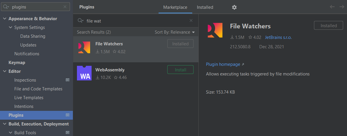
- You will need the SASS and File Watchers Plugins. To download them, press Ctrl + Alt + S and access the plugin page by searching for it like this:
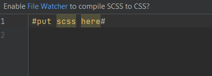
- With the file watchers plugin, you will now be met with this message at the top of your scss file. Make sure to press yes.
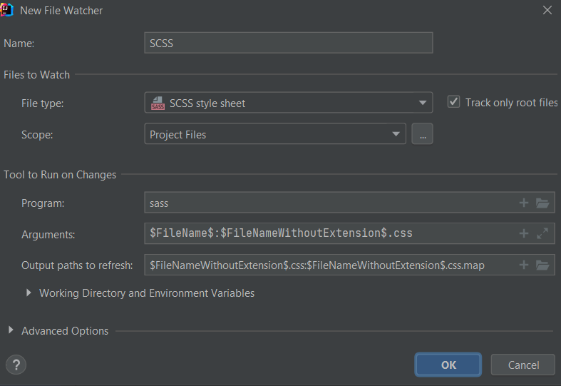
- You will then probably be greeted with this window/ if not go to file watchers to create a new file watcher. The settings should look as follows, make sure you enable it afterwards by clicking on the checkbox:
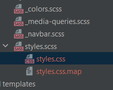
- Afterwards, underneath your scss file you should have a styles.css file and a styles.css.map file like this:
- As you all know, the great thing about scss is that it writes the css for you, making it much less tedious. However, there are many aspects as to why it actually simplifies the process.
- Sass naturally transpiles all the .scss files directly. However, when you want to import a file, you do not need the file to be transpiled directly. Sass has a mechanism for this: If you start the filename with an underscore, Sass will not transpile it. Files named this way are called partials and they allow you to work in a much more organized space.

- Rather than retyping the hexadecimal values of each color every single time, you can define all of the ones you want to use in a partial and then just reference them with $[color] when you want to use it. However, make sure you import the partial into the scss file where you are going to use it in.
$light: #f7f7f7;
$dark: #222121;
$lime: #00cc66;
$orangeRed: #fb4b4e;
$blue: #2541b2;- Example shown here:
.navbar {
  background: $light; // see how instead of having to retype the hexadecimal, I can just reference it like this WOWOW so COOL
  height: 80px;
  display: flex;
  justify-content: space-between;
  padding: 0.5rem calc((100vw - 1200px) / 2);
  z-index: 10;
position: relative;- Another unique aspect about scss is that you can actually nest styles, so if you want an aspect like let's say color to apply to everything you are working on for that portion of the html, you can actually nest the rest of the formatting, animations, etc within that definition.
- Implementation shown here with the Hero section in my scss:
.hero {
  background-color: $light; // see how the rest of the code is indented / nested within .hero

  &__container {
    display: grid;
    grid-template-columns: 1fr 1fr;
    align-items: center;
    justify-items: center;
    margin: 0 auto;
    height: 90vh;
    z-index: 1;
    width: 100%;
    max-width: 1200px;
    padding-right: 24px;
    padding-left: 24px;

    @include tablet { // @include tablet and @include mobile will be explained next
      grid-template-columns: 1fr;
      height: 100%;
    }

    &--left {
      width: 100%;
      line-height: 1.2;

      @include tablet {
        padding: 5rem 0;
      }

      @include mobile {
        line-height: 1.5;
      }
    }

    &--left h1 {
      font-size: 4rem;
      color: $lime;

      @include mobile {
        font-size: 1.5rem;
      }
    }

    &--left h2 {
      font-size: 4rem;
      color: $dark;

      @include mobile {
        font-size: 2rem;
      }
    }

    &--left p {
      font-size: 2rem;
      color: $dark;
      margin-top: 1rem;
      font-weight: 700;

      @include mobile {
        font-size: 1.5rem;
      }
    }

    &--btn {
      font-size: 1rem;
      background-color: $lime;
      padding: 14px 32px;
      border: none;
      border-radius: 4px;
      color: $light;
      margin-top: 2rem;
      cursor: pointer;
      position: relative;
      transition: all 0.3s;
      outline: none;
    }

    &--btn a {
      position: relative;
      z-index: 2;
      color: $light;
      text-decoration: none;
    }

    &--btn:after { // code animates home page button so that it transitions to red when hovered
      position: absolute;
      content: '';
      top: 0;
      left: 0;
      width: 0;
      height: 100%;
      background: $orangeRed;
      transition: all 0.3s;
      border-radius: 4px;
    }

    &--btn:hover:after {
      width: 100%;
    }

    &--right {
      text-align: center;
    }

    &--img {
      height: 100%;
      width: 100%;
    }
  }
}- You can see how this code works in tandem with the Hero section of the HTML, the class definitions are associated with every definition of styling coded above:
<!-- Hero Section -->
<div class="hero"> // each of the classes here correspond to what's defined above in the scss
    <div class="hero__container">
        <div class="hero__container--left">
            <h1>College Apps Are Coming!</h1>
            <h2>Be Prepared</h2>
            <p>Sign up now to join the list.</p>
            <button class="hero__container--btn"><a href="#">Sign Up</a></button>
        </div>
        <div class="hero__container--right">
            <img
                    src="images/img-2.svg"
                    class="hero__container--img"
            />
        </div>
    </div>
</div>- With the power of scss, you can more easily than ever change the formatting of your site based on which device a person is using.
- Such can be done by defining the resolutions in a partial like here:
@mixin tablet {
  @media screen and (max-width: 768px) {
    @content;
  }
}

@mixin mobile {
  @media screen and (max-width: 280px) {
    @content;
  }
}- Then you can use @include to reference these resolutions and change the css/formatting based on the device like here:
    &--left h1 {
      font-size: 4rem;
      color: $lime;

      @include mobile { // in this case the font size changes because it's mobile
        font-size: 1.5rem;
      }
    }

    &--left h2 {
      font-size: 4rem;
      color: $dark;

      @include mobile {
        font-size: 2rem;
      }
    }
- In scss, you can also use @extend if you want certain classes to inherit attributes from previously defined classes, sort of similar to nesting inheritance (where the classes nested within inherit the attributes from outermost classes). An example is shown below:
%align-center {
  display: flex;
  align-items: center;
}

logo {
    color: $dark;
    cursor: pointer;
    text-decoration: none;
    font-size: 2rem;
    margin-left: 24px;
    @extend %align-center; //it's inheriting the above values for display and align:items
}- Furthermore, you can actually use math operators like multiplication, addition, subtraction and division in scss. In the code below I use it to extend the animation of a button:
    &--btn:hover:after {
      width: 100% * 4; //makes the animation extend way farther, past the border of the button
}- These are just some videos I found that are helpful, click on the images to go directly to the videos!