Адаптивная веб-страница с динамической сменой темы в зависимости от времени суток.
Responsive web page that changes theme colors depending on the time of the day.
🔗 Demo
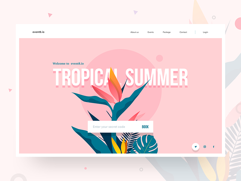
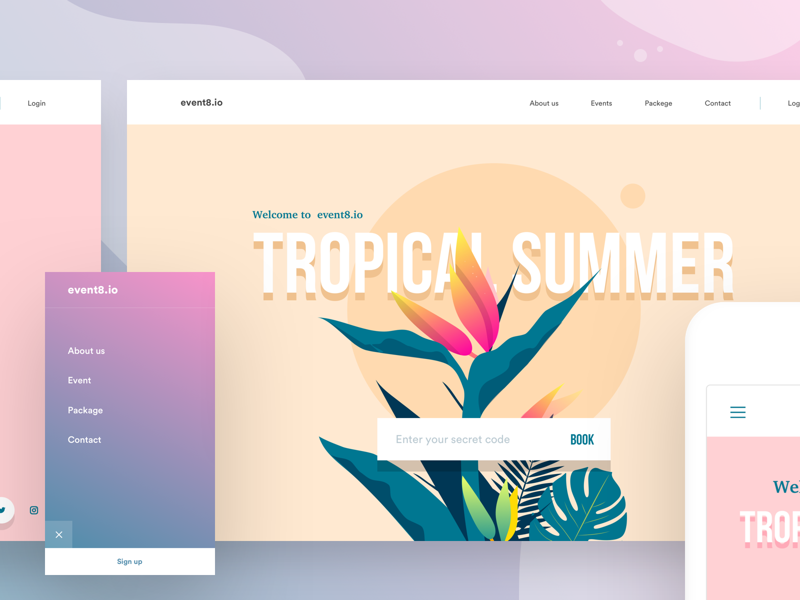
Русский: Проект создан по вдохновению от дизайна Divan Raj и реализует адаптивную веб-страницу, которая автоматически меняет цветовую палитру в зависимости от времени суток: утро, день, вечер.
English: The project was inspired by the design of Divan Raj and implements a responsive web page that automatically changes its color palette depending on the time of day: morning, day, evening.
 |
 |
|---|
 |
|---|
| Особенность / Feature | Описание / Description |
|---|---|
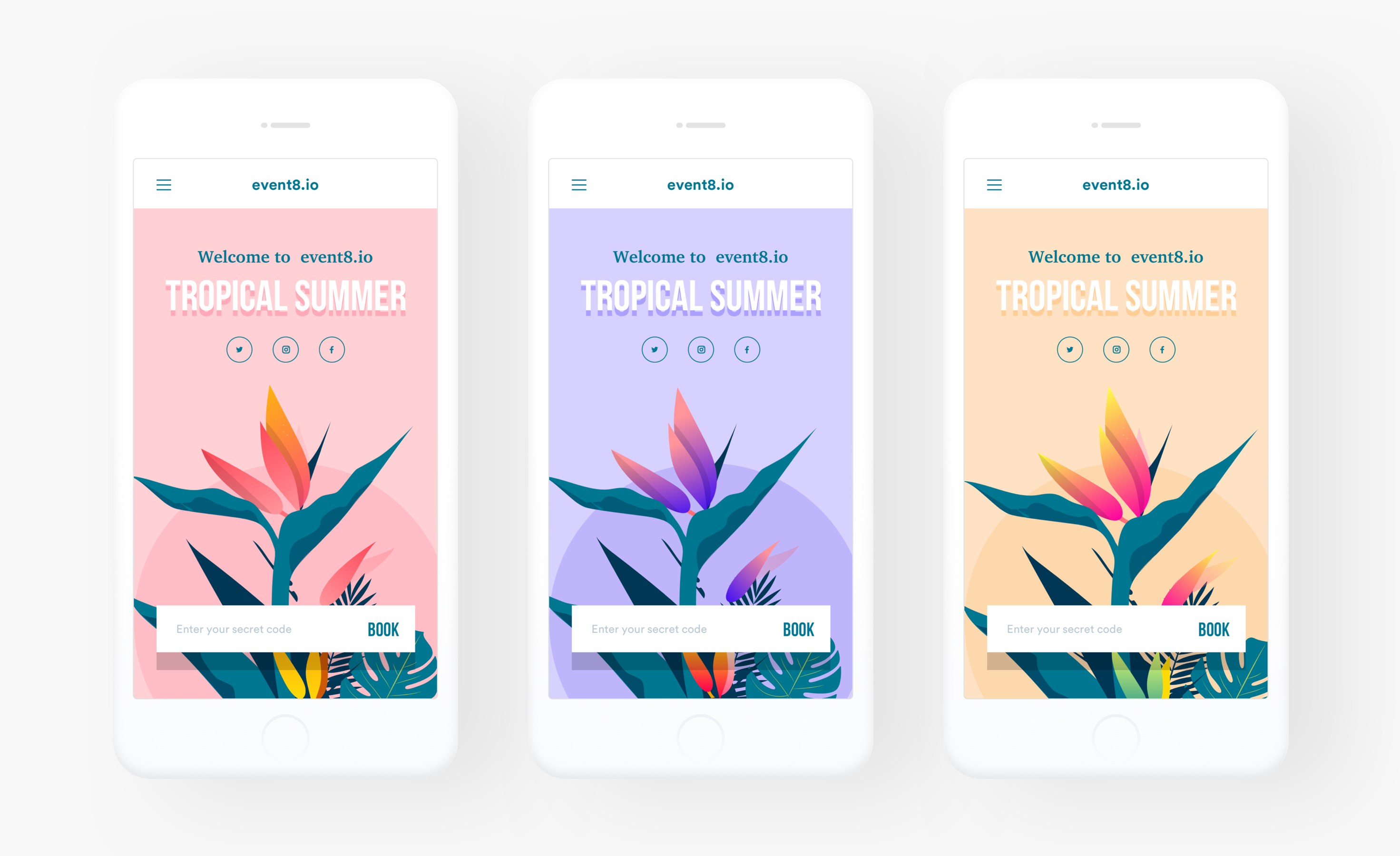
| Адаптивный дизайн | Корректное отображение на всех устройствах: мобильные, планшеты, десктопы. |
| Responsive Design | Correct display on all devices: mobile, tablet, desktop. |
| Динамическая смена темы | Автоматическая смена цветовой палитры в зависимости от времени суток. |
| Dynamic Theme Switching | Automatic color palette change depending on the time of day. |
| Sass | Использование препроцессора для удобного управления стилями и переменными. |
| Sass | Using a preprocessor for convenient style and variable management. |
| Минималистичный дизайн | Современный и стильный вид с акцентом на графике и социальных ссылках. |
| Minimalist Design | Modern and stylish look with a focus on graphics and social links. |
Смена темы реализована с помощью JavaScript / Theme switching is implemented using JavaScript
- Определение текущего времени / Determine the current time:
const hour = new Date().getHours();
- Установка класса для
<body>в зависимости от времени / Set a class for based on time:if (hour >= 5 && hour < 12) { document.body.classList.add('morning'); } else if (hour >= 12 && hour < 18) { document.body.classList.add('day'); } else { document.body.classList.add('evening'); }
- CSS-стили для каждой темы / CSS styles for each theme:
body.morning {
  --bg-color: #f8e8d1;
  --text-color: #333;
  --accent-color: #ff9a8b;
}
Адаптивность реализована с помощью медиа-запросов в CSS / Responsive design is implemented using media queries in CSS:
@media (max-width: 768px) {
  .container {
    flex-direction: column;
    align-items: center;
  }
  .flower {
    width: 80%;
  }
}Этот проект лицензируется по Creative Commons Attribution-NonCommercial 4.0 International (CC BY-NC 4.0).
This project is licensed under the Creative Commons Attribution-NonCommercial 4.0 International (CC BY-NC 4.0) License.