
A powerful Vue 3 WYSIWYG editor component library for building visual page builders. Create, edit, and manage page content through an intuitive drag-and-drop interface with a comprehensive sidebar editor for block configuration.
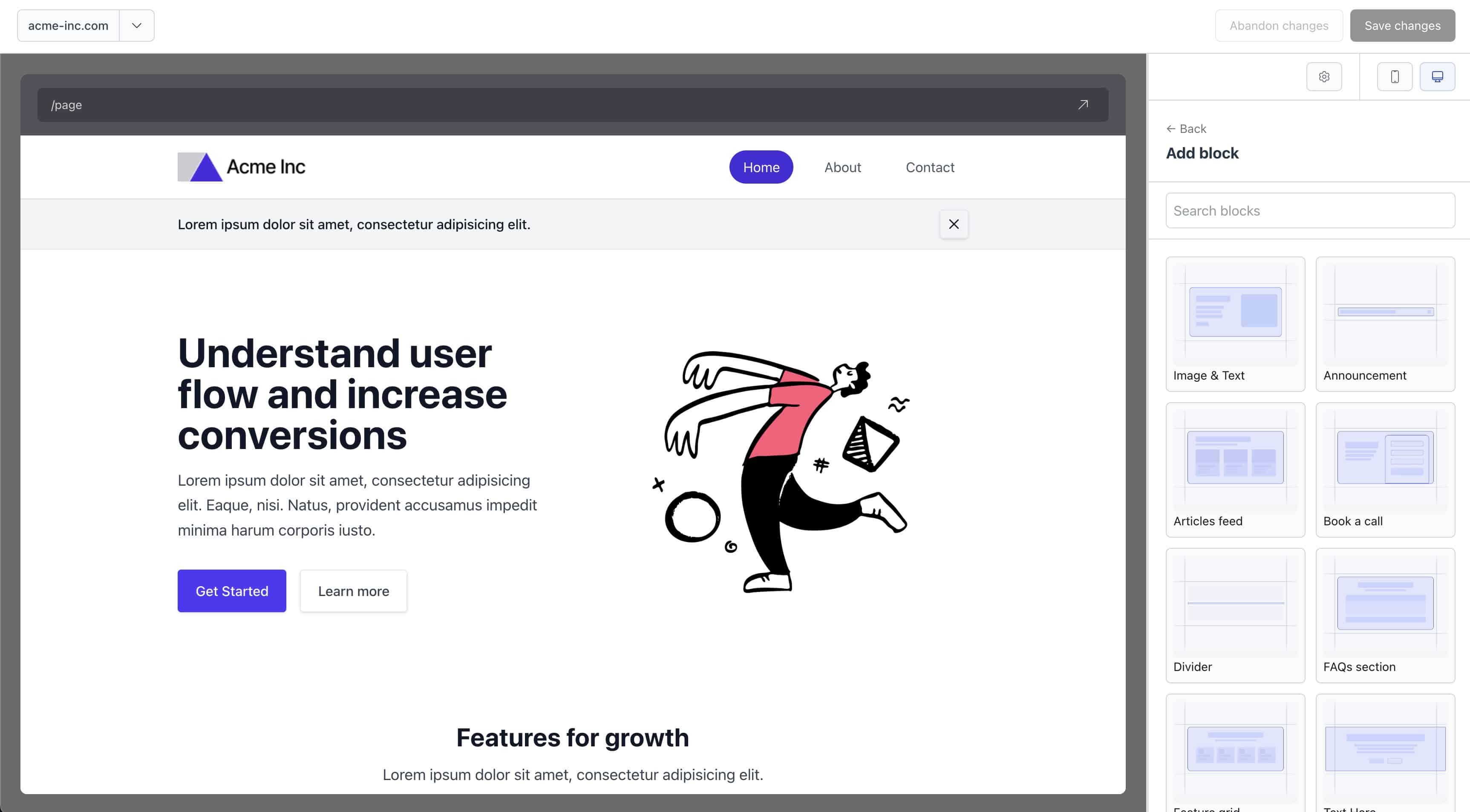
vue-wswg-editor is a Vue 3 component library that provides a complete page builder solution. It enables developers to create visual editors where users can:
- Drag and drop blocks to build pages visually
- Edit block properties through a comprehensive sidebar editor
- Preview pages in real-time with responsive viewport controls
- Manage page layouts with customizable layout components
- Define custom blocks with field configurations and validation
The library uses a JSON-based data structure, making it easy to store, version, and transfer page configurations.
- 🎨 Visual Page Builder - Intuitive drag-and-drop interface for building pages
- 📝 Rich Field Editor - Comprehensive sidebar with support for multiple field types
- 🎯 Block Management - Add, remove, reorder, and configure blocks with ease
- 📱 Responsive Preview - Preview pages in desktop and mobile viewports
- 🎨 Customizable Layouts - Support for multiple page layouts
- 🔧 Field Validation - Built-in validation with custom validator support
- 📦 TypeScript - Full TypeScript support with comprehensive type definitions
- 🔌 Vite Plugin - Automatic block, layout, and field discovery via Vite plugin
- 🎯 Zero Config Blocks - Blocks are automatically discovered from your project structure
npm install vue-wswg-editorThe library requires Vue 3.4.0 or higher:
npm install vue@^3.4.0The library requires a Vite plugin to automatically discover blocks, layouts, and fields from your project structure.
// vite.config.ts
import { defineConfig } from "vite";
import vue from "@vitejs/plugin-vue";
import { vueWswgEditorPlugin } from "vue-wswg-editor/vite-plugin";

export default defineConfig({
   plugins: [
      vue(),
      vueWswgEditorPlugin({
         rootDir: "@page-builder", // Path alias to your page-builder directory
      }),
   ],
   resolve: {
      alias: {
         "@page-builder": fileURLToPath(new URL("./src/page-builder", import.meta.url)),
      },
   },
});Create a page-builder directory in your project with the following structure:
src/
  page-builder/
    blocks/          # Block components
      hero/
        Hero.vue
        fields.ts    # Optional: Field definitions
      divider/
        Divider.vue
    layout/          # Layout components
      default.vue
      marketing.vue
<!-- src/page-builder/blocks/hero/Hero.vue -->
<template>
   <section class="hero-section">
      <h1>{{ heading }}</h1>
      <p>{{ description }}</p>
   </section>
</template>

<script setup lang="ts">
defineProps<{
   heading: string;
   description: string;
}>();
</script>// src/page-builder/blocks/hero/fields.ts
import { createField } from "vue-wswg-editor";
export default {
heading: createField({
type: "text",
label: "Heading",
required: true,
default: "Welcome",
}),
description: createField({
type: "textarea",
label: "Description",
rows: 4,
}),
};<template>
<WswgPageBuilder
v-model="pageData"
blocksKey="blocks"
settingsKey="settings"
:url="`/page`"
:showBrowserBar="true"
:editable="true"
defaultBlockMargin="small"
/>
</template>
<script setup lang="ts">
import { ref } from "vue";
import { WswgPageBuilder } from "vue-wswg-editor";
import "vue-wswg-editor/style.css";
const pageData = ref({
blocks: [],
settings: {},
});
</script>The library requires a specific directory structure for automatic discovery:
src/
  page-builder/
    blocks/              # Block components (required)
      {blockName}/
        {BlockName}.vue # Block component (PascalCase)
        fields.ts       # Field definitions (optional)
        thumbnail.png   # Block thumbnail (optional)
    layout/              # Layout components (required)
      {layoutName}.vue  # Layout component
- Block directories should use kebab-case (e.g.,
hero-section) - Block components should use PascalCase matching the directory name (e.g.,
HeroSection.vue) - The library automatically matches block types to components using name variations
- Layout files should use kebab-case (e.g.,
default.vue,marketing.vue) - Layouts are referenced by their filename (without extension)
The main editor component for building and editing pages.
| Prop | Type | Default | Description |
|---|---|---|---|
modelValue / v-model |
Record<string, any> |
- | Page data object containing blocks and settings |
editable |
boolean |
false |
Enable/disable editing mode |
loading |
boolean |
false |
Show loading state |
url |
string |
"" |
URL displayed in browser navigation bar |
showBrowserBar |
boolean |
false |
Show browser navigation bar in preview |
blocksKey |
string |
"blocks" |
Key in pageData for blocks array |
settingsKey |
string |
"settings" |
Key in pageData for settings object |
defaultBlockMargin |
"none" | "small" | "medium" | "large" |
"none" |
Default margin for blocks |
header- Custom header content above the editortoolbar- Custom toolbar contentloading- Custom loading state
update:modelValue- Emitted when page data changes
<WswgPageBuilder v-model="pageData" :editable="true" :showBrowserBar="true" defaultBlockMargin="small">
  <template #header>
    <div class="custom-header">My Page Editor</div>
  </template>
  <template #toolbar>
    <button @click="save">Save</button>
  </template>
</WswgPageBuilder>Render pages without the editor interface. Useful for displaying pages in production.
<template>
   <PageRenderer
      :blocks="pageData.blocks"
      :layout="pageData.settings.layout"
      :settings="pageData.settings"
      :with-layout="true"
   />
</template>

<script setup lang="ts">
import { PageRenderer } from "vue-wswg-editor";
</script>| Prop | Type | Default | Description |
|---|---|---|---|
blocks |
Block[] |
- | Array of block data |
layout |
string |
"default" |
Layout name to use |
settings |
Record<string, any> |
{} |
Page settings object |
withLayout |
boolean |
true |
Whether to wrap blocks in layout component |
Fields define the editable properties of blocks. Use createField to define field configurations:
import { createField } from "vue-wswg-editor";

export default {
   // Text input
   title: createField({
      type: "text",
      label: "Title",
      placeholder: "Enter title",
      required: true,
   }),

   // Textarea
   description: createField({
      type: "textarea",
      label: "Description",
      rows: 4,
   }),

   // Number input
   count: createField({
      type: "number",
      label: "Count",
      default: 0,
      min: 0,
      max: 100,
   }),

   // Select dropdown
   theme: createField({
      type: "select",
      label: "Theme",
      options: [
         { label: "Light", value: "light", id: "light" },
         { label: "Dark", value: "dark", id: "dark" },
      ],
   }),

   // Color picker
   backgroundColor: createField({
      type: "color",
      label: "Background Color",
      default: "#ffffff",
   }),

   // Repeater field
   items: createField({
      type: "repeater",
      label: "Items",
      fields: {
         title: createField({ type: "text", label: "Title" }),
         description: createField({ type: "textarea", label: "Description" }),
      },
   }),

   // Margin field
   margin: createField({
      type: "margin",
      label: "Margin",
      default: { top: "small", bottom: "small" },
   }),
};text- Single-line text inputtextarea- Multi-line text inputnumber- Number input with min/max/stepboolean- Checkboxemail- Email input with validationurl- URL input with validationselect- Dropdown selectcheckbox- Checkbox groupradio- Radio button groupcolor- Color pickerrange- Range sliderrepeater- Repeating field groupsmargin- Margin configuration (top/bottom)info- Read-only information displaycustom- Custom field component
| Option | Type | Description |
|---|---|---|
type |
EditorFieldType |
Field type (required) |
label |
string |
Field label |
description |
string |
Help text below field |
placeholder |
string |
Input placeholder |
required |
boolean |
Whether field is required |
default |
any |
Default value |
hidden |
boolean |
Hide field from editor |
group |
string |
Group field in sidebar |
options |
Array<{label, value, id}> |
Options for select/radio/checkbox |
min / max |
number |
Min/max for number/range |
step |
number |
Step for number/range |
rows |
number |
Rows for textarea |
validator |
ValidatorFunction |
Custom validation function |
component |
Component |
Custom component for custom type |
import { getLayouts, initialiseRegistry } from "vue-wswg-editor";

// Get all available layouts
const layouts = getLayouts();

// Initialize registry (called automatically by plugin)
await initialiseRegistry();import { validateField, validateAllFields } from "vue-wswg-editor";
// Validate a single field
const result = await validateField(fieldConfig, value);
// Validate all fields in a block
const results = await validateAllFields(blockFields, blockData);The vueWswgEditorPlugin scans your project for blocks, layouts, and fields. It requires a rootDir option pointing to your page-builder directory.
interface VueWswgEditorPluginOptions {
   /**
    * Root directory path (can use Vite aliases like "@page-builder")
    * Example: "@/features/homepage" or "@page-builder"
    */
   rootDir: string;
}The plugin creates virtual modules that are automatically populated:
vue-wswg-editor:blocks- All block componentsvue-wswg-editor:layouts- All layout componentsvue-wswg-editor:fields- All field definition filesvue-wswg-editor:thumbnails- Block thumbnail images
These virtual modules are used internally by the library to discover and load your components.
The library expects page data in the following format:
interface PageData {
   blocks: Block[];
   settings: {
      layout?: string;
      [key: string]: any;
   };
}

interface Block {
   id: string;
   type: string;
   [key: string]: any; // Block-specific properties
}
Example:
{
   "blocks": [
      {
         "id": "block-1",
         "type": "hero",
         "heading": "Welcome",
         "description": "This is a hero section"
      },
      {
         "id": "block-2",
         "type": "divider"
      }
   ],
   "settings": {
      "layout": "default",
      "title": "My Page"
   }
}# Install dependencies
npm install
# Run development server (watches for changes)
npm run dev
# Build library
npm run build
# Run tests
npm run test:unit
# Type check
npm run tscheck
# Lint
npm run lint
# Format code
npm run format-fixTo use this package locally in another project during development:
- Build the library (required before linking):
npm run build- Create a global symlink:
npm link- Link the package in your consuming project:
cd /path/to/your/project
npm link vue-wswg-editor- Rebuild after changes:
After making changes to the library, rebuild (npm run build) for changes to be reflected in the consuming project.
To unlink:
# In the consuming project
npm unlink vue-wswg-editor

# In the vue-wswg-editor directory (optional)
npm unlinkvue-wswg-editor/
├── src/
│ ├── components/ # Vue components
│ │ ├── WswgPageBuilder/ # Main editor component
│ │ ├── PageRenderer/ # Page renderer component
│ │ ├── BlockComponent/ # Block wrapper component
│ │ └── ... # Other components
│ ├── util/ # Utility functions
│ │ ├── fieldConfig.ts # Field configuration utilities
│ │ ├── registry.ts # Block/layout registry
│ │ └── validation.ts # Validation utilities
│ ├── types/ # TypeScript type definitions
│ ├── vite-plugin.ts # Vite plugin implementation
│ └── index.ts # Library entry point
├── dist/ # Built library files
└── test/ # Test files
The library includes comprehensive TypeScript definitions. All components, utilities, and types are fully typed.
import type { EditorFieldConfig, ValidatorFunction, ValidationResult } from "vue-wswg-editor";- Chrome (latest)
- Firefox (latest)
- Safari (latest)
- Edge (latest)
This project is licensed under the MIT License - see the LICENSE file for details.
MIT License allows you to:
- ✅ Use the software commercially
- ✅ Modify the software
- ✅ Distribute the software
- ✅ Sublicense the software
- ✅ Private use
The only requirement is that you include the original copyright and license notice in any copy of the software or substantial portions of the software.
Contributions are welcome! Please feel free to submit a Pull Request or open an issue for any bugs, feature requests, or improvements you'd like to see.
- vue-wswg-demos - Demo project showing how to use vue-wswg-editor
- Demo Theme - Demo page builder theme with example blocks, layouts, and custom fields (included in the demos project)