CSS
CSS - Cascading Style Sheets
a style sheet language used for describing the look and formatting of a document written in a markup language like HTML.
With CSS, you can define the layout, colors, fonts, and other visual aspects of a web page.
CSS works by selecting elements in the HTML document and applying styles to those elements. The styles are defined in a separate CSS file or embedded in the HTML document itself.
CSS styles can be applied to elements based on their tag name, class, ID, or other attributes.
In CSS, selectors are used to target and apply styles to specific elements in an HTML document.
Selectors can be based on a variety of criteria, including element names, IDs, classes, attributes, and more.
Here are some common CSS selectors:
-
Element/ Type Selector: The element selector targets all instances of a particular HTML element. For example, the selectorptargets all paragraph elements in the document.p { color: red; }
-
Class Selector: The class selector targets all elements that have a specific class attribute. Class selectors are denoted by a dot (".") followed by the class name. For example, the selector.my- classtargets all elements with the class attribute "my-class"..my-class { font-size: 18px; }
-
ID Selector: The ID selector targets a single element with a specific ID attribute. ID selectors are denoted by a hash symbol ("#") followed by the ID name. For example, the selector#my-idtargets the element with the ID attribute "my-id".#my-id { background-color: yellow; }
-
Descendant Selector: The descendant selector targets an element that is a descendant of another element. This selector is denoted by a space between two other selectors. For example, the selectorul litargets all list items that are descendants of unordered lists.ul li { font-weight: bold; }
-
Child Selector: The child selector targets an element that is a direct child of another element. This selector is denoted by the ">" symbol between two other selectors. For example, the selectorul > litargets all list items that are direct children of unordered lists.ul > li { list-style: none; }
-
Attribute Selector: The attribute selector targets elements with a specific attribute. This selector is denoted by square brackets and the name of the attribute. For example, the selector[type="text"]targets all input elements with the type attribute set to "text".input[type="submit"] { background-color: blue; }
A property is a keyword or a set of keywords that are associated with a value.
-
Border: This property sets the border around an element. -
Margin: This property sets the margin around an element. -
Padding: This property sets the padding inside an element. -
Text-align: This property sets the horizontal alignment of text inside an element. -
Text-decoration: This property sets the decoration (e.g. underline, strikethrough) on text inside an element. -
Display: This property sets how an element should be displayed (e.g. block, inline, none). -
Position: This property sets the positioning of an element (e.g. static, relative, absolute, fixed). -
Float: This property sets the horizontal positioning of an element (e.g. left, right). -
Overflow: This property sets what happens when an element's content overflows its container. -
Box-sizing: This property sets how the width and height of an element are calculated (e.g. content-box, border-box). -
Transition: This property sets the transition effect for an element when its style changes. -
Transform: This property sets the transformation (e.g. rotation, scaling) of an element. -
Box-shadow: This property sets the shadow around an element. -
Background-image: This property sets the background image of an element. -
Z-index: This property sets the stacking order of positioned elements.
CSS uses a set of rules to define styles. Each rule consists of a selector and one or more declarations.
The selector specifies which element or elements the rule applies to, and the declarations define the styles to be applied to those elements. Declarations consist of a property name and a value, separated by a colon.
Here's an example of a CSS rule that sets the font size of all paragraphs with a class of "intro" to 16 pixels:
p.intro {
  font-size: 16px;
}In order to get our CSS talking to our HTML, we need to reference our CSS file within our HTML. The best practice for referencing our CSS is to include all of our styles in a single external style sheet, which is referenced from within the <head> element of our HTML document.
To create our external CSS style sheet, we’ll want to use our text editor of choice to create a new plain text file with a .css file extension. Our CSS file should be saved within the same folder, or a subfolder, where our HTML file is located.
Within the <head> element of the HTML document, the <link> element is used to define the relationship between the HTML file and the CSS file. Because we are linking to CSS, we use the rel attribute with a value of stylesheet to specify their relationship. Furthermore, the href (or hyperlink reference) attribute is used to identify the location, or path, of the CSS file.
<head>
  <link rel="stylesheet" href="main.css">
</head>
Other options for referencing CSS include using internal and inline styles.
Every web browser has its own default styles for different elements. How Google Chrome renders headings, paragraphs, lists, and so forth may be different from how Internet Explorer does. To ensure cross-browser compatibility, CSS resets have become widely used.
CSS resets take every common HTML element with a predefined style and provide one unified style for all browsers. These resets generally involve removing any sizing, margins, paddings, or additional styles and toning these values down. Because CSS cascades from top to bottom our reset needs to be at the very top of our style sheet.
Doing so ensures that those styles are read first and that all of the different web browsers are working from a common baseline.
/* http://meyerweb.com/eric/tools/css/reset/
   v2.0 | 20110126
   License: none (public domain)
*/

html, body, div, span, applet, object, iframe,
h1, h2, h3, h4, h5, h6, p, blockquote, pre,
a, abbr, acronym, address, big, cite, code,
del, dfn, em, img, ins, kbd, q, s, samp,
small, strike, strong, sub, sup, tt, var,
b, u, i, center,
dl, dt, dd, ol, ul, li,
fieldset, form, label, legend,
table, caption, tbody, tfoot, thead, tr, th, td,
article, aside, canvas, details, embed,
figure, figcaption, footer, header, hgroup,
menu, nav, output, ruby, section, summary,
time, mark, audio, video {
	margin: 0;
	padding: 0;
	border: 0;
	font-size: 100%;
	font: inherit;
	vertical-align: baseline;
}
/* HTML5 display-role reset for older browsers */
article, aside, details, figcaption, figure,
footer, header, hgroup, menu, nav, section {
	display: block;
}
body {
	line-height: 1;
}
ol, ul {
	list-style: none;
}
blockquote, q {
	quotes: none;
}
blockquote:before, blockquote:after,
q:before, q:after {
	content: '';
	content: none;
}
table {
	border-collapse: collapse;
	border-spacing: 0;
}
The code applies the following styles to all HTML elements:
- Sets the margin, padding, and border of all elements to 0.
- Sets the font-size of all elements to 100%.
- Inherits the font family of the parent element for all elements.
- Sets the vertical alignment of all elements to baseline.
The code also applies the following styles to specific HTML elements:
- Sets the display property of the following elements to block: article, aside, details, figcaption, figure, footer, header, hgroup, menu, nav, and section.
- Sets the line-height of the body element to 1.
- Removes the default quotation marks for blockquote and q elements.
- Removes any spacing between table cells.
Inline styling refers to the practice of adding styles directly to an HTML element using the "style" attribute. This allows you to add styles to an individual element without the need for a separate CSS file. Inline styling is useful for small or one-off changes, but it is generally not recommended for larger projects, as it can become difficult to manage and maintain as the codebase grows.
Here's an example of how to add inline styling to an HTML element:
<p style="color: blue; font-size: 16px;">
This text is blue and 16 pixels in size.
</p>
You can add multiple styles to an element using inline styling, by separating them with a semicolon (;). Here's an example:
<p style="color: blue; font-size: 16px; margin-top: 20px;">
This text is blue, 16 pixels in size, and has a top margin of 20 pixels.
</p>
Inline styling can be useful in certain situations, such as:
- Making small or one-off changes: If you need to make a small change to an element, such as changing its color or font size, inline styling can be a quick and easy way to do this without having to create a separate CSS file.
- Email templates: When creating email templates, it's common to use inline styling to ensure that the email looks consistent across different email clients, which may not support external stylesheets.
- Testing styles: When you're first developing a site, it can be useful to test different styles on individual elements using inline styles before finalizing the styles in a separate stylesheet.
- Overriding external styles: In some cases, you may want to override a specific style that's defined in an external stylesheet. In this case, you can use inline styling to apply a specific style to an individual element.
CSS specificity is a measure of how specific a CSS selector is, and determines which styles are applied to an element when there are conflicting styles defined.
In general, the more specific a selector is, the higher its specificity, and the more weight its styles carry.
The specificity of a CSS selector is determined by the number of selectors and the types of selectors used. Here's a breakdown of how specificity is calculated:
-
ID selectors: An ID selector is the most specific type of selector, and has the highest specificity. An ID selector consists of the "#" symbol followed by the ID of an element, and is written like this:#example-id. -
Class selectors,attribute selectors, andpseudo-classes: These selectors are less specific than ID selectors, but more specific than element selectors. Class selectors start with a "." symbol, attribute selectors are enclosed in square brackets, and pseudo-classes start with a ":" symbol. -
Element selectors: These selectors are the least specific, and have the lowest specificity. An element selector targets all instances of a specific HTML element on a page. For example, the "p" selector will target all paragraphs on a page.
Here's how to compute the specificity value for a CSS selector:
- Start with a base specificity 0
- For each ID selector in the selector, add 100 to the specificity value.
- For each class
.classor pseudo class:hoveror attribute[href]selector in the selector, add 10 to the specificity value. - For each element selector
divor pseudo-element:beforein the selector, add 1 to the specificity value. - Inline style gets a specificity value of 1000, and is always given the highest priority!
- For each level of nesting in the selector, add the specificity value of the parent selector.
- If the selector contains the universal selector (*) or combinators (+, >, ~), do not add any specificity points.
- If two selectors have the same specificity value, the one that appears last in the CSS file will take precedence.
| Selector | Specificity | Calculation |
|---|---|---|
| p | 1 | 1 |
| p.test | 11 | 1 + 10 |
| p#demo | 101 | 1 + 100 |
<p style="color: pink;"> |
1000 | 1000 |
| #demo | 100 | 100 |
| .test | 10 | 10 |
| p.test1.test2 | 21 | 1 + 10 + 10 |
| #navbar p#demo | 201 | 100 + 1 + 100 |
* |
0 | 0 |
When multiple selectors are used to target the same element, the selector with the highest specificity will take precedence. If two selectors have the same specificity, the one that appears last in the stylesheet will take precedence.
N/B:
- The pseudo-class
:not()adds no specificity by itself, only what’s inside it’s parentheses. - The
!importantvalue appended a CSS property value is an automatic win. It overrides even inline styles from the markup. The only way an !important value can be overridden is with another !important rule declared later in the CSS and with equal or great specificity value otherwise. You could think of it as adding 10000 to the specificity value.
In CSS, the box model is a concept that describes how elements on a web page are laid out and how their size is calculated.
It consists of four layers:
-
Content layer: This is where the actual content of the element is located, such as text or an image. -
Padding layer: This layer surrounds the content and provides space between the content and the border. -
Border layer: This layer surrounds the padding and provides a visible boundary around the element. -
Margin layer: This layer surrounds the border and provides space between the element and adjacent elements on the page.
These layers are visualized as a series of nested boxes, with the content layer being the innermost box and the margin layer being the outermost box.
+--------------------------------+
|             margin             |
|                                |
|  +--------------------------+  |
|  |          border          |  |
|  |                          |  |
|  |  +--------------------+  |  |
|  |  |       padding      |  |  |
|  |  |                    |  |  |
|  |  |  +--------------+  |  |  |
|  |  |  |   content    |  |  |  |
|  |  |  |              |  |  |  |
|  |  |  +--------------+  |  |  |
|  |  |                    |  |  |
|  |  +--------------------+  |  |
|  |                          |  |
|  +--------------------------+  |
|                                |
+--------------------------------+
The box model includes several properties that affect the sizing, positioning, and appearance of an element.
Here are some of the key box properties in CSS:
-
Widthandheight: These properties set the dimensions of an element's content area. By default, the width and height do not include padding, border, or margin. -
Padding: Padding is the space between an element's content area and its border. You can set padding on all sides of an element using the padding property, or you can set it separately for each side using padding-top, padding-right, padding-bottom, and padding-left. -
Border: The border surrounds an element's padding and content area. You can set the width, style, and color of an element's border using the border property. You can also set these properties separately for each side of the border using border-top, border- right, border-bottom, and border-left. -
Margin: The margin is the space outside an element's border. You can set margin on all sides of an element using the margin property, or you can set it separately for each side using margin-top, margin- right, margin-bottom, and margin-left. -
Box-sizing: This property controls how the size of an element is calculated. By default, the size of an element is calculated as the sum of its content width and height, plus any padding, border, and margin. If you set the box-sizing property to border-box, however, the size of the element will be calculated as the sum of its content width and height, including padding and border. -
Display: This property determines how an element is laid out on the page. Some common values for the display property include block, inline, and inline-block.
CSS Flexbox is a layout module in CSS that allows developers to easily arrange and align elements within a container.
It aims at providing a more efficient way to lay out, align and distribute space among items in a container, even when their size is unknown and/or dynamic
A flex container expands items to fill available free space or shrinks them to prevent overflow.
It is a one-dimensional layout system, meaning it deals with either columns or rows, but not both at the same time.
The basic idea behind flexbox is to give the container the ability to expand and shrink its items to best fill the available space.
This is achieved by using a set of properties on the container(parent element aka flex container)and its children (aka flex items), which allow you to specify the direction, order, alignment, spacing, and sizing of the elements within the container.
the flex layout is based on “flex-flow directions”.
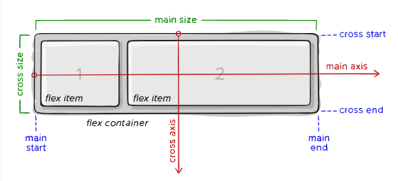
Items will be laid out following either the main axis (from main-start to main-end) or the cross axis (from cross-start to cross-end).
-
main axis– The primary axis along which flex items are laid out. It is not necessarily horizontal; it depends on theflex- directionproperty -
main-start | main-end– The flex items are placed within the container starting from main-start and going to main-end. -
main size– A flex item’s width or height, whichever is in the main dimension, is the item’s main size. -
cross axis– The axis perpendicular to the main axis. Its direction depends on the main axis direction. -
cross-start | cross-end– Flex lines are filled with items and placed into the container starting on the cross-start side of the flex container and going toward the cross-end side. -
cross size– The width or height of a flex item, whichever is in the cross dimension, is the item’s cross size.
Some of the key properties used in flexbox include:
- Properties for the Parent (flex container):
-
display: flex- This sets the container to be a flex container. A value ofinline-flexwill set the children to be inline elements.container{ display: flex; /*or inline-flex*/ }
-
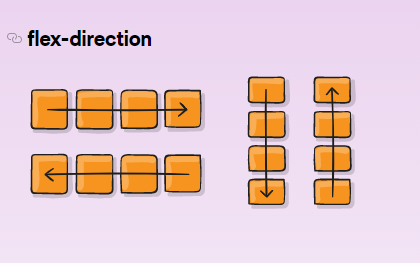
flex-direction- This specifies the direction of the main axis, which can be row or column..container { flex-direction: row | row-reverse | column | column-reverse; }
- row (default): left to right
- row-reverse: right to left in
- column: same as row but top to bottom
- column-reverse: same as row-reverse but bottom to top
-
-
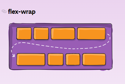
flex-wrap- This controls whether the items should wrap to the next line when they reach the end of the container. By default, flex items will all try to fit onto one line..container { flex-wrap: nowrap | wrap | wrap-reverse; }
-
nowrap(default): all flex items will be on one line -
wrap: flex items will wrap onto multiple lines, from top to bottom. -
wrap-reverse: flex items will wrap onto multiple lines from bottom to top.
-
-
flex-flow: This is a shorthand for the flex-direction and flex- wrap.container { flex-flow: column wrap; }
-
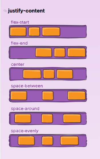
justify-content- This aligns items along the main axis. It helps distribute extra free space leftover when either all the flex items on a line are inflexible, or are flexible but have reached their maximum size..container { justify-content: flex-start | flex-end | center | space-between | space-around | space-evenly | start | end | left | right ... + safe | unsafe; }
There are also two additional keywords you can pair with these values: safe and unsafe. Using safe ensures that however you do this type of positioning, you can’t push an element such that it renders off-screen
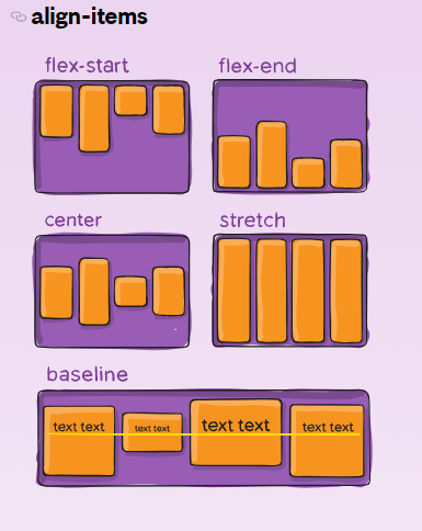
-
align-items- This aligns items along the cross axis..container { align-items: stretch | flex-start | flex-end | center | baseline | first baseline | last baseline | start | end | self- start | self-end + ... safe | unsafe; }
- stretch (default): stretch to fill the container (still respect min-width/max-width)
-
align-content: Used to align a flex container's lines within the container when there is extra space in the cross axis. It applies only when the flex container has multiple lines of items that wrap because offlex-wrap: wraporflex-wrap: wrap- reverse. The align-content property works similar to justify- content, but it aligns the lines of items in the cross axis rather than the individual items themselves..container { align-content: flex-start | flex-end | center | space-between | space-around | space-evenly | stretch | start | end | baseline | first baseline | last baseline + ... safe | unsafe; }
-
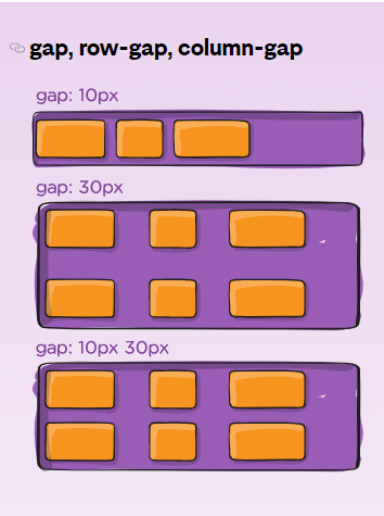
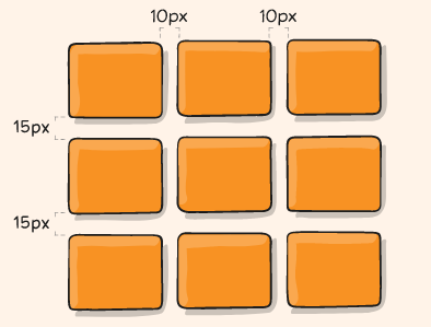
gap,row-gap,column-gap: explicitly controls the space between flex items..container { display: flex; ... gap: 10px; gap: 10px 20px; /* row-gap column gap */ row-gap: 10px; column-gap: 20px; }
-
Properties for the Children (flex items)
-
order- This specifies the order in which items should appear in the flex container. By default, flex items are laid out in the source order. However, the order property controls the order in which they appear in the flex container. Items with the same order revert to source order..item { order: 5; /* default is 0 */ }
-
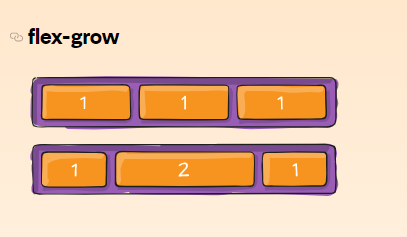
flex-grow: This defines the ability for a flex item to grow if necessary. It accepts a unitless value that serves as a proportion. It dictates what amount of the available space inside the flex container the item should take up. If all items have flex-grow set to 1, the remaining space in the container will be distributed equally to all children. Negative numbers are invalid..item { flex-grow: 4; /* default 0 */ }
-
-
flex-shrink: This defines the ability for a flex item to shrink if necessary. Negative numbers are invalid..item { flex-shrink: 3; /* default 1 */ }
-
flex-basis
-
flex: This is the shorthand for flex-grow, flex-shrink and flex-basis combined. The second and third parameters (flex- shrink and flex-basis) are optional. The default is 0 1 auto, but if you set it with a single number value, like flex: 5;, that changes the flex-basis to 0%, so it’s like setting flex- grow: 5; flex-shrink: 1; flex-basis: 0%;..item { flex: none | [ <'flex-grow'> <'flex-shrink'>? || <'flex-basis'> ] }
-
align-self: This allows the default alignment (or the one specified by align-items) to be overridden for individual flex items..item { align-self: auto | flex-start | flex-end | center | baseline | stretch; }
Note that float, clear and vertical-align have no effect on a flex item.
play with flexbox here
More on flexbox here
CSS grid is a layout system in CSS that allows web developers to create complex, responsive layouts for their web pages. It allows for the creation of grid-based layouts that are divided into rows and columns, and can be used to position and size elements within those rows and columns.
CSS grid has two main components: the grid container and the grid items. The grid container is the parent element that contains all the grid items, and is defined using the display: grid property. The grid items are the child elements that are placed within the grid container, and are defined using the grid-column and grid-row properties.
CSS grid also allows for the creation of responsive layouts that can adapt to different screen sizes and devices. This is done through the use of media queries and the grid-template-areas property, which allows for the creation of named grid areas that can be rearranged or hidden based on the screen size.
Similar to flexbox, the source order of the grid items doesn’t matter. Your CSS can place them in any order, which makes it super easy to rearrange your grid with media queries.
-
Grid Container: It is the parent element that holds all the grid items. The element on whichdisplay: gridis applied. -
Grid Item: It is the child element inside a grid container. -
Grid Line: These are the horizontal and vertical lines that divide the grid container into rows and columns. -
Grid Track: It is the space between two grid lines, either a row or a column. -
Grid Cell: It is the space between two adjacent horizontal and vertical grid lines, which is the intersection of a row and column. -
Grid Area: It is the rectangular area created by the intersection of one or more grid cells. -
Grid Template: It is the blueprint of the grid that defines the number of rows and columns, their size, and their order. -
Grid Template Areas: It is a shorthand property that allows you to define the grid template by giving names to areas in the grid. -
Grid Template Columns and Rows: These are properties that allow you to define the size and position of columns and rows in the grid. -
Grid Gap: It is the space between two adjacent rows or columns in the grid. It can be set using the gap property. -
Implicit Grid: It is the grid that is created automatically when there are more grid items than the number of cells defined in the grid template.
-
display: Defines the element as a grid container and establishes a new grid formatting context for its contents. values:- grid – generates a block-level grid
- inline-grid – generates an inline-level grid
.container {
  display: grid | inline-grid;
}
-
grid-template-columns,grid-template-rows: These properties are used to define the size and number of columns and rows in the grid.-
<track-size>- a fixed size for a track (e.g. 100px). -
auto- the size of the track is determined by the size of its content. -
minmax(min, max)- a size that's at least min and at most max. -
repeat(n, track-size)- repeats track-size n times.
.parent {
  grid-template-columns: 100px 1fr 2fr; /* Three columns with fixed, flexible,
and flexible sizes respectively */
  grid-template-rows: repeat(3, 100px); /* Three rows with fixed size of 100px
*/
}
-
-
grid-template-areas: This property is used to create a visual grid template by assigning names to grid areas.
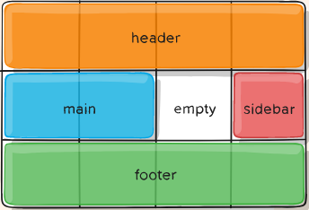
.- empty cell.name- a named grid areanone- no grid areas are defined.parent { display: grid; grid-template-columns: 50px 50px 50px 50px; grid-template-rows: auto; grid-template-areas: "header header header header" "main main . sidebar" "footer footer footer footer"; } .item-a { grid-area: header; } .item-b { grid-area: main; } .item-c { grid-area: sidebar; } .item-d { grid-area: footer; }
That’ll create a grid that’s four columns wide by three rows tall. The entire top row will be composed of the header area. The middle row will be composed of two main areas, one empty cell, and one sidebar area. The last row is all footer.
-
grid-template: This is a shorthand property that combines grid-template- rows, grid-template-columns, and grid-template-areas.
.parent {
  grid-template:
    "header header header" 100px
    "sidebar content content" 1fr
    "footer footer footer" 100px / 1fr 2fr; /* A grid with named areas and different track sizes */
}-
grid-column-gapandgrid-row-gap: These properties are used to set the size of the gap between grid columns and rows, respectively..parent { /* standard */ column-gap: <line-size>; row-gap: <line-size>; /* old */ grid-column-gap: <line-size>; grid-row-gap: <line-size>; }
Example:
.container {
  grid-template-columns: 100px 50px 100px;
  grid-template-rows: 80px auto 80px;
  column-gap: 10px;
  row-gap: 15px;
}
The gutters are only created between the columns/rows, not on the outer edges.
-
grid-gap: This is a shorthand property that combines grid-column-gap and grid-row-gap.-
<length>- a fixed size for both the gap between columns and the gap between rows.
.parent {
  grid-gap: 20px; /* 20px gap between columns and rows */
  gap: 15px 10px;
}
-
-
justify-itemsandalign-items: These properties are used to align grid items along the horizontal and vertical axis, respectively.-
start- aligns the item to the start of the grid cell. -
end- aligns the item to the end of the grid cell. -
center- aligns the item to the center of the grid cell. -
stretch- stretches the item to fill the grid cell.
.parent {
  justify-items: center; /* Horizontally centers all items */
  align-items: end; /* Vertically aligns all items to the bottom */
}
This behavior can also be set on individual grid items via the [align-self] (https://css-tricks.com/snippets/css/complete-guide-grid/#prop-align-self) property.
-
-
place-items: sets both the align-items and justify-items properties in a single declaration.-
<align-items> / <justify-items>– The first value sets align-items, the second value justify-items. If the second value is omitted, the first value is assigned to both properties.
.center {
  display: grid;
  place-items: center;
 }
-
-
justify-contentandalign-content: These properties are used to align the entire grid along the horizontal and vertical axis, respectively.-
start- aligns the grid along the start of the container. -
end- aligns the grid along the end of the container. -
center- aligns the grid in the center of the container. -
stretch- stretches the grid to fill the container.
.parent {
  justify-content: center; /* Horizontally centers the entire grid */
  align-content: space-around; /* Vertically spaces the rows with equal space
around them */
}
-
-
place-content: sets both the align-content and justify-content properties in a single declaration. Values:<align-content> / <justify-content>– The first value sets align-content, the second value justify-content. If the second value is omitted, the first value is assigned to both properties. -
grid-auto-columnsandgrid-auto-rows: These properties are used to define the default size of grid tracks that are created automatically (aka implicit grid tracks). Implicit tracks get created when there are more grid items than cells in the grid-
<track-size>- a fixed size for automatically created rows or columns. Can be a length, a percentage, or a fraction of the free space in the grid (using the [fr](https://css-tricks.com/snippets/css/complete-guide-grid/#fr- unit) unit)(e.g. 100px). -
auto- the size of the track is determined by the size of its content. -
minmax(min, max)- a size that's at least min and at most max.
Example:
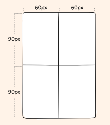
.container {
  grid-template-columns: 60px 60px;
  grid-template-rows: 90px 90px;
}
This creates a 2 x 2 grid.
-
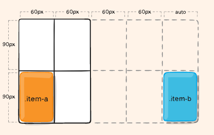
But now imagine you use grid-column and grid-row to position your grid items like this:
.item-a {
  grid-column: 1 / 2;
  grid-row: 2 / 3;
}
.item-b {
  grid-column: 5 / 6;
  grid-row: 2 / 3;
}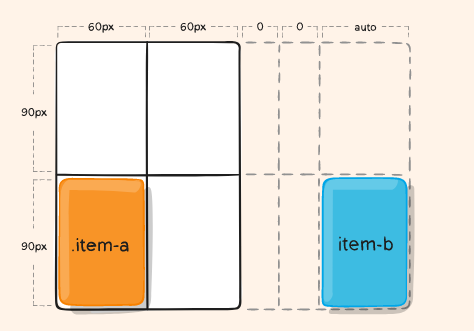
We told .item-b to start on column line 5 and end at column line 6, but we
never defined a column line 5 or 6. Because we referenced lines that don’t
exist, implicit tracks with widths of 0 are created to fill in the gaps.
We can use grid-auto-columns and grid-auto-rows to specify the widths of
these implicit tracks:
.container {
  grid-auto-columns: 60px;
}
-
grid-auto-flow: This property is used to specify the direction of the flow of grid items when they exceed the number of cells defined in the grid template or If you have grid items that you don’t explicitly place on the grid, the auto-placement algorithm kicks in to automatically place the items.-
row- new items are added to new rows when the previous row is full. -
column- new items are added to new columns when the previous column is full. -
dense- items are placed in the first available cell, even if it leaves a gap elsewhere.
Example:
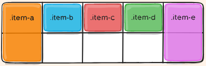
Consider this HTML:<section class="container"> <div class="item-a">item-a</div> <div class="item-b">item-b</div> <div class="item-c">item-c</div> <div class="item-d">item-d</div> <div class="item-e">item-e</div> </section>
You define a grid with five columns and two rows, and set grid-auto-flow to row (which is also the default):
.container {
  display: grid;
  grid-template-columns: 60px 60px 60px 60px 60px;
  grid-template-rows: 30px 30px;
  grid-auto-flow: row;
}
When placing the items on the grid, you only specify spots for two of them:
.item-a {
  grid-column: 1;
  grid-row: 1 / 3;
}
.item-e {
  grid-column: 5;
  grid-row: 1 / 3;
}
Because we set grid-auto-flow to row, our grid will look like this. Notice how the three items we didn’t place (item-b, item-c and item-d) flow across the available rows:
-
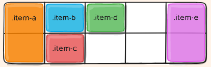
If we instead set grid-auto-flow to column, item-b, item-c and item-d flow down the columns:
-
grid-column-start,grid-column-end,grid-row-start,grid-row-end: Determines a grid item’s location within the grid by referring to specific grid lines. grid-column-start/grid-row-start is the line where the item begins, and grid-column-end/grid-row-end is the line where the item ends. Values:-
<line>– can be a number to refer to a numbered grid line, or a name to refer to a named grid line -
span <number>– the item will span across the provided number of grid tracks -
span <name>– the item will span across until it hits the next line with the provided name -
auto– indicates auto-placement, an automatic span, or a default span of one
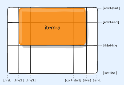
Example:
.item-a {
  grid-column-start: 2;
  grid-column-end: five;
  grid-row-start: row1-start;
  grid-row-end: 3;
}
-
.item-b {
  grid-column-start: 1;
  grid-column-end: span col4-start;
  grid-row-start: 2;
  grid-row-end: span 2;
}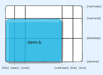
If no grid-column-end/grid-row-end is declared, the item will span 1 track by default.
Items can overlap each other. You can use z-index to control their stacking order.
-
grid-column,grid-row: shorthand for grid-column-start + grid-column-end and grid-row-start + grid-row-end respectively. Values:- / – each one accepts all the same values as the longhand version, including span
.item-c {
  grid-column: 3 / span 2;
  grid-row: third-line / 4;
}
If no end line value is declared, the item will span 1 track by default.
-
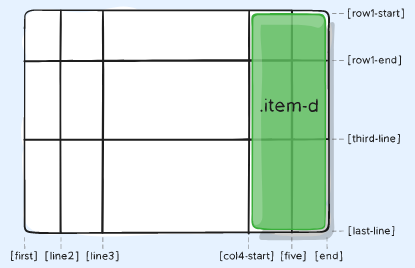
grid-area: Gives an item a name so that it can be referenced by a template created with the grid-template-areas property. Alternatively, this property can be used as an even shorter shorthand for grid-row-start + grid-column-start grid-row-end + grid-column-end.item { grid-area: <name> | <row-start> / <column-start> / <row-end> / <column-
end>; }
Examples:
As a way to assign a name to the item:

```css
.item-d {
  grid-area: header; /* The grid item occupies the area named "header" */
}
As the short-shorthand:
.item-d {
  grid-area: 1 / col4-start / last-line / 6;
}
-
justify-self and align-self: Horizontally and Vertically aligns the item in the grid cell respectively-
start- aligns the item to the start of the grid cell. -
end- aligns the item to the end of the grid cell. -
center- aligns the item to the center of the grid cell. -
stretch- stretches the item to fill the grid cell.
.child {
  justify-self: end; /* Horizontally aligns the item to the end of the grid
cell */
  align-self: center; /* Vertically aligns the item to the center of the grid
cell */
}
-
-
place-self: place-self sets both the align-self and justify-self properties in a single declaration. Values:-
auto– The “default” alignment for the layout mode. -
<align-self> / <justify-self>– The first value sets align-self, the second value justify-self. If the second value is omitted, the first value is assigned to both properties..item-a { place-self: center; }
-
Accessibility is the practice of making your websites usable by as many people as possible.
You might also think of accessibility as treating everyone the same, and giving them equal opportunities, no matter what their ability or circumstances
- Sites should be accessible to keyboard, mouse, and touch screen users, and any other way users access the web, including screen readers and voice assistants like Alexa and Google Home.
- Applications should be understandable and usable by people regardless of auditory, visual, physical, or cognitive abilities.
- Sites should also not cause harm: web features like motion can cause migraines or epileptic seizures.
The Firefox Accessibility Inspector is a very useful tool for checking out accessibility issues on web pages.
A great deal of web content can be made accessible just by making sure the correct HTML elements are always used for the correct purpose.
- Visual Impairments: blindness, low-level vision, color blindness. Some users will rely on screen readers, which is software that reads digital text aloud.